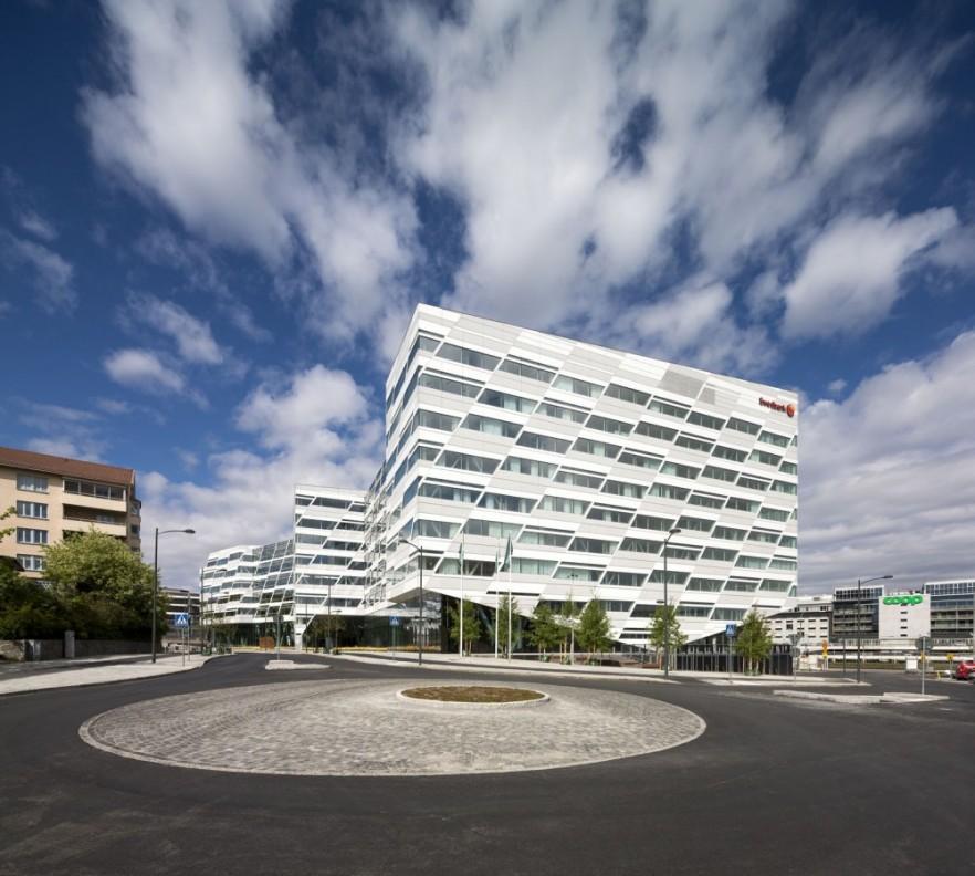
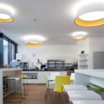
Swedbank is one really innovative in terms of commercial corporate interior design and architecture. 3XN developed a project that truly reflects the bank’s values – openness, care and simplicity. Transparency is the key feature that makes it possible for the construction to function as a mirror of the Swedbank’s vision for fair play in business. As a result the project turned into a solid corporate building with modern silhouette and interior design that attract not only visitors but is a great place for the employees, too.
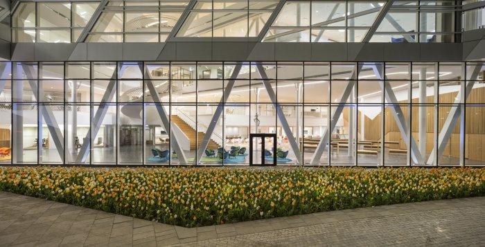
V-shaped solution
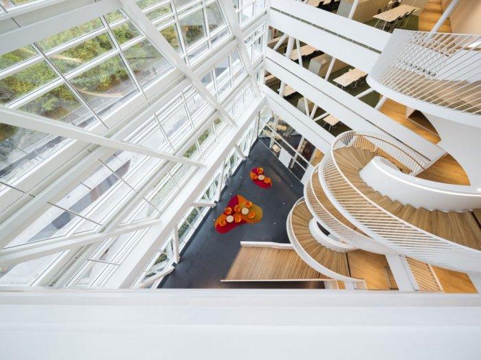
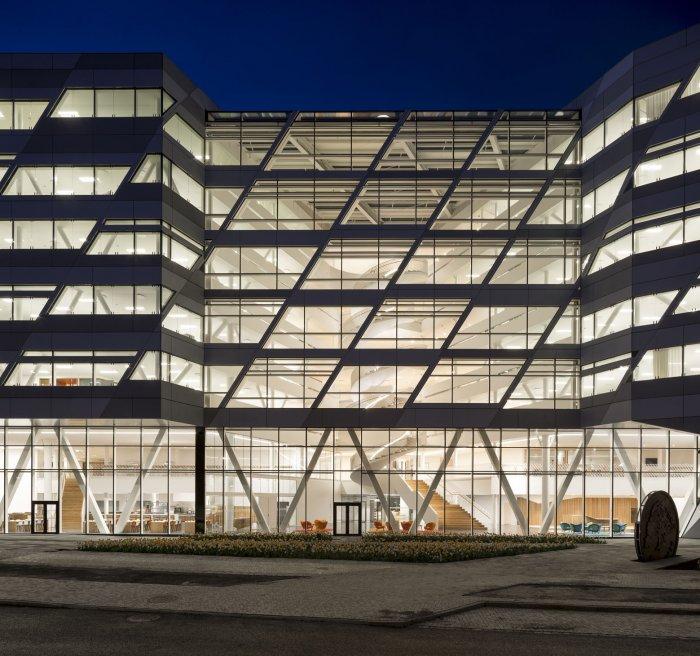
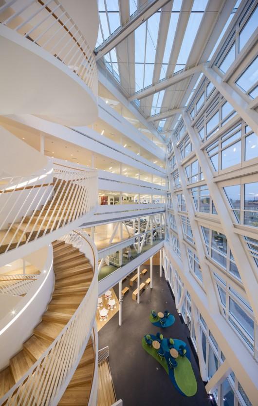
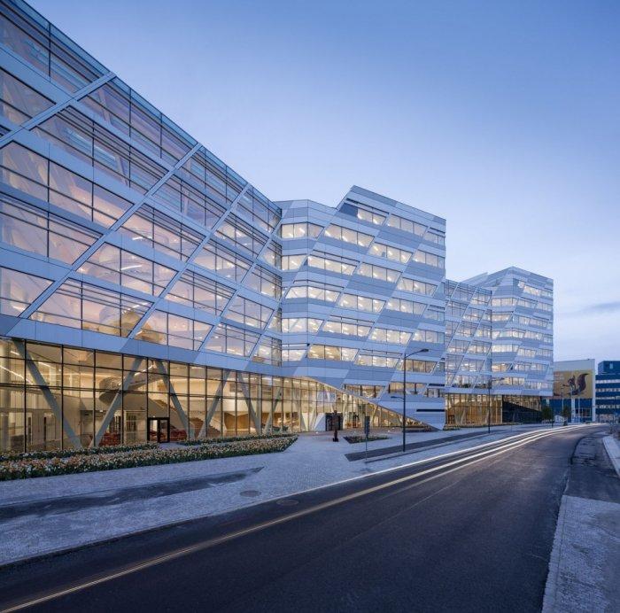
When looking at the architecture of the building one can notice the triple V-shaped structure that functions as a divider of the volume, creating functional areas with inviting interior and eye-catching exterior look. In terms of functionality, the V-shape give the opportunity for closer collaboration between employees without being able to disturb each other working environment. In terms of building stable business foundations this means shorter distances, great internal communication, visual contact and ability to share knowledge between the working islands and departments. The architects also had in mind to provide great looks towards the surroundings when they projected the atria of the bank. Daylight is able to penetrate the entire place and provide it with natural illumination. This results in lower energy consumption which makes the bank a great example of sustainable architecture.
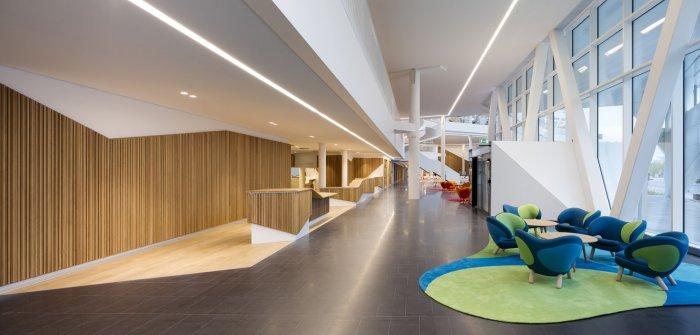
It is not only the visual contact and internal shortcuts that the V legs create but they also give a kind of variation between the floors. As you can see, they are linking the floors and ceilings of each floor as open footbridges. It has been a clever decision to use such kind of architectural features because this way the architects were able to provide the essential openness and variation of shapes inside as well as outside of the bank. V-shaped legs also contribute to a working environment that follows all healthy advices for a modern office space, as well as they are able to ensure human scale in a large building.
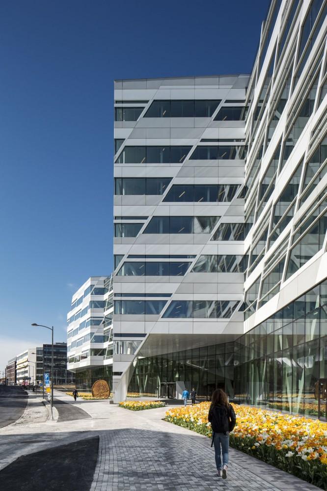
Inside the bank one can find a restaurant and conference facilities on the lower floors. There is also the reception area. All facades are made of glass that emphasizes the organisation’s attitude to transparency in business.
Interaction and Visual Contact
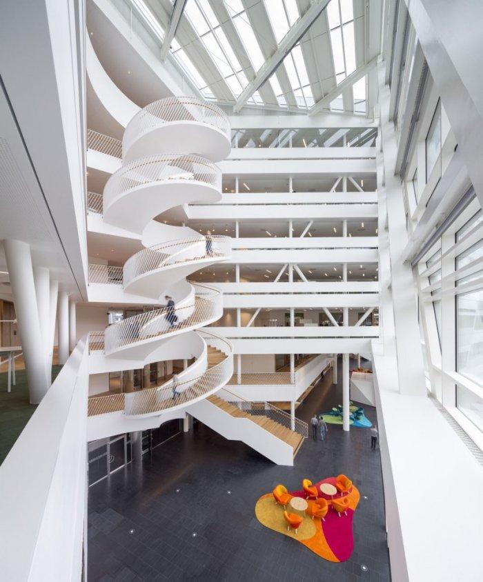
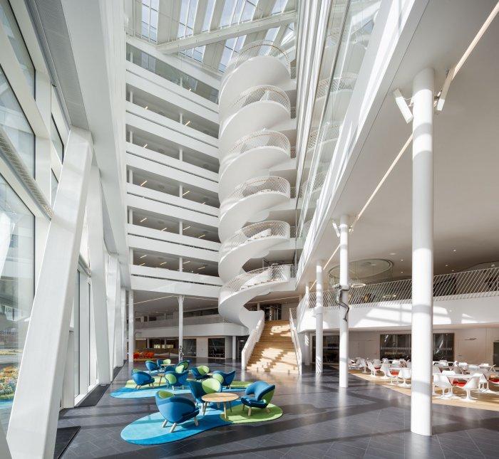
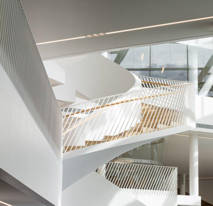
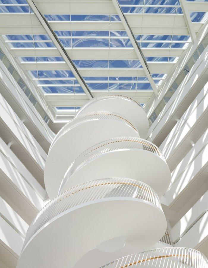
Two spiral staircases welcome the staff and the visitors of the bank. Once you take them you are able to enjoy the building from many different perspective as reaching the desired floor.
Above the lowers floors with functional areas where visitors are being served, the upper levels consists of offices that create a particularly cover portico extending itself over the base. A visual break up appears that divides the volume into more compact geometric units.
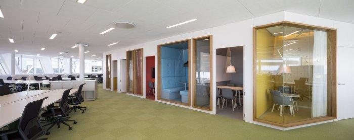
Just above the public are is the heart of the bank – the trading department. If we have to characterize the interior design of this modern banks and its department, we should outline that the intensity and condensed interior is contrasted by the high ceilings that provide absolutely stunning feel of endless volume. Now, talking about the other floors and the office areas we have to say that they are projected in the manner of open plan working spaces – with desk islands and service facilities. A main corridor creates the shortest route through the different departments and islands providing great ability of undisturbed communication. A great way to provoke creativity and informal conversations is the organization and grouping of kitchen area, wardrobes, lounge corners into the main axis.
There is everything needed for the normal working process of a bank – traditional and fixed working spaces, temporary workstations for those colleagues that are just making formal visits, and touch-down areas for meetings. The building also has three terraces and a recreational zone thus following all standards of professional and social activities.
And it is not a coincidence that Swedbank’s modern bank office has received a Gold certification from Miljöbyggnad – a sustainability rating system in Sweden. What a better way to emphasize the core value of the bank strategy – social sustainability and transparency.
Photographs: Adam Mõrk
If you like to see another impressive bank interior design project, watch the video!
