THE SCHOOL AS AN INSPIRING AND UNCONVENTIONAL ENVIRONMENT HAS BECOME RECENTLY A CHALLENGE FOR A GROWING NUMBE OF ARCHITECTS AND DESIGNERS. TWO SCHOOLS -PANTA THEI IN DUTCH TOWN OF AMSSTELVEEN AND SCHOOL IN LOS ANGELES MADE AN IMPRESSION WITH THE IMAGINATION AND IDEAS BEHIND THE PROJECT.
PANTA RHEI
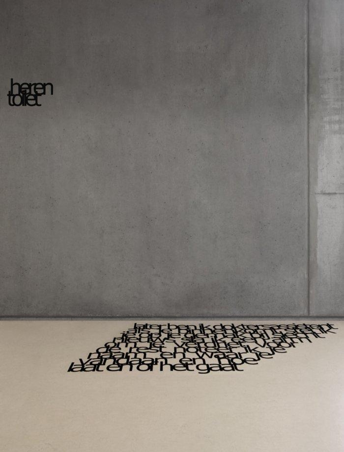
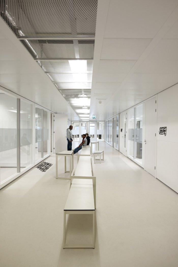
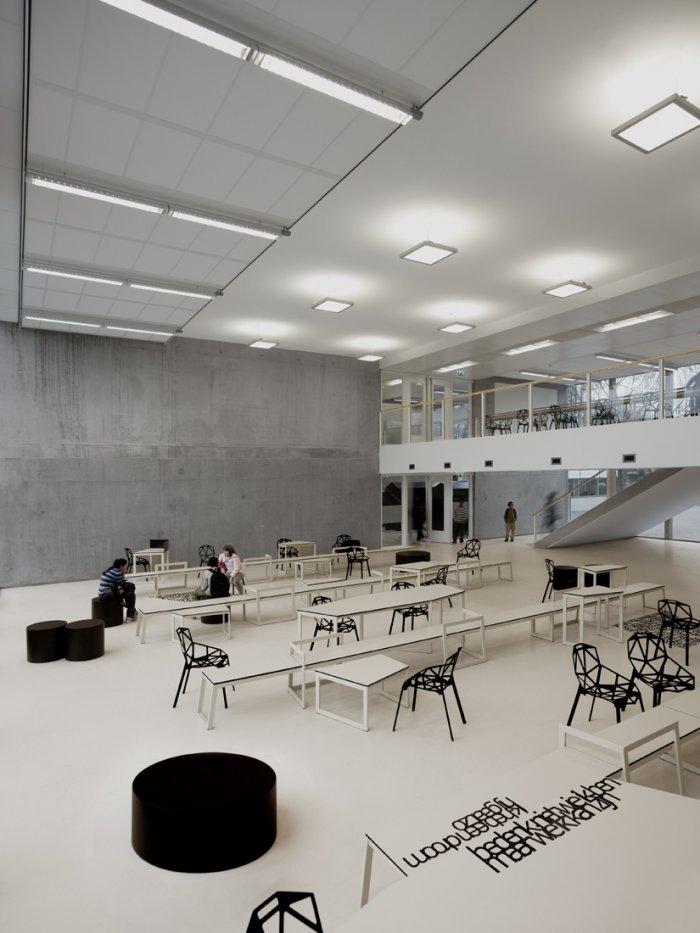
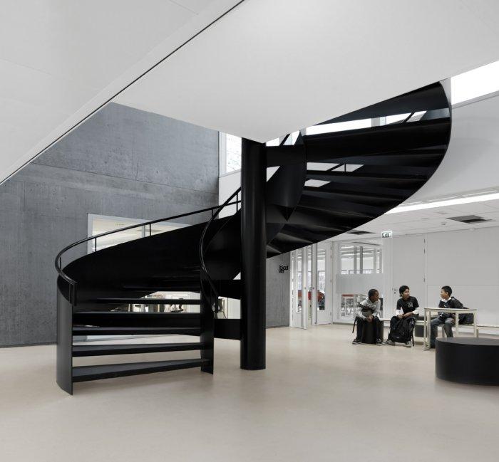
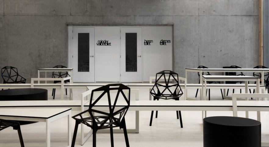
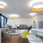
The architects from Snelder Architecten project Panta Rhei building with many multifunctional spaces and their unique atmosphere is created by Dutch studio i29. They are inspired by the name of the school meaning “everything flows” and turned to a design that is dynamic and leaves room to the imagination. They choose elements, which can be variously used and at the same time reflect the school identity. Adoption of text as a message and as a purely graphical accent is one of the impressive techniques in i29’s design. Linoleum floors, furniture and facades are partially covered with text in which the words are so arrange that it seems they float one above the other. There are poems of Erik Jan
The architects from Snelder Architecten project Panta Rhei building with many multifunctional spaces and their unique atmosphere is created by Dutch studio i29. They are inspired by the name of the school meaning “everything flows” and turned to a design that is dynamic and leaves room to the imagination. They choose elements, which can be variously used and at the same time reflect the school identity. Adoption of text as a message and as a purely graphical accent is one of the impressive techniques in i29’s design. Linoleum floors, furniture and facades are partially covered with text in which the words are so arrange that it seems they float one above the other. There are poems of Erik Jan
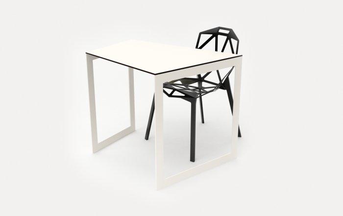
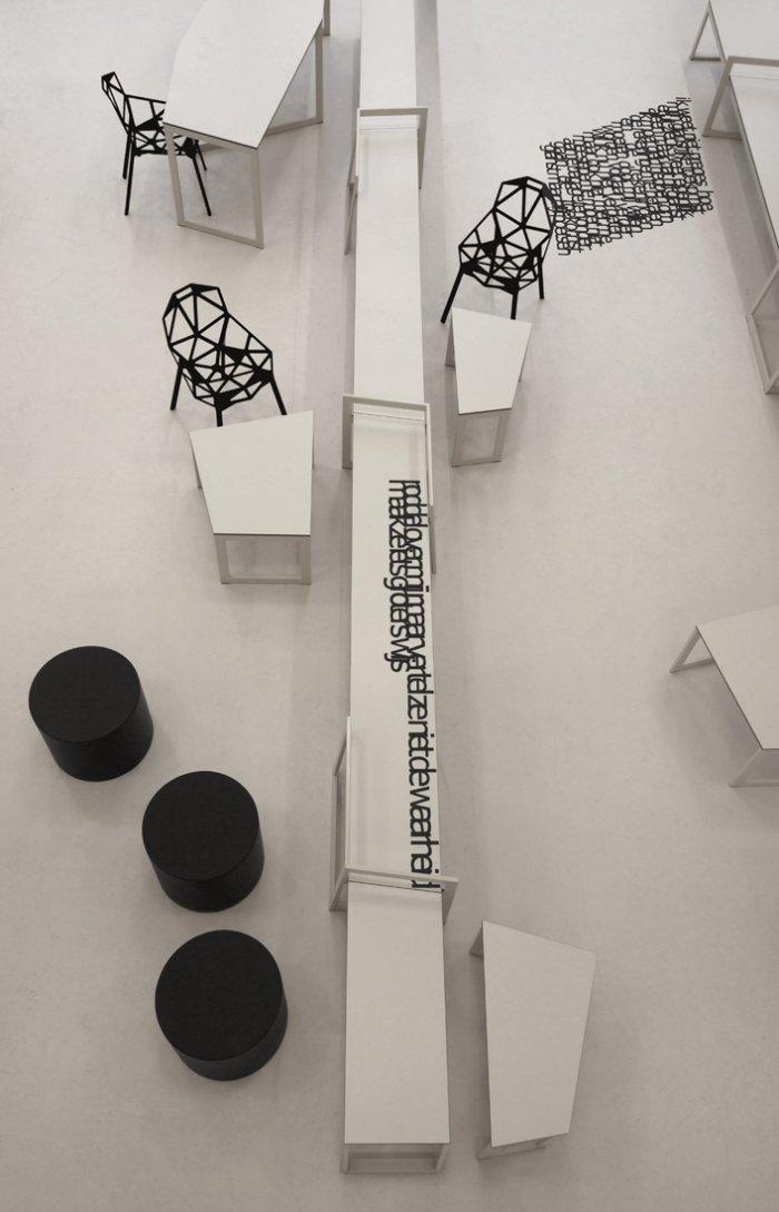
Harmens, which treat concepts as friendship and insecurity, which definitely excite the students. Furniture is also designed in the spirit of dynamics, imagination and interpretation. Tables are asymmetric with many angles, which allows for different combinations upon desire to work alone or in a team. Extremely powerful is the presence of Chair One by Konstantin Grcic. Designers chose it because of its constructive shape and the provocation to think what it was made of. Contrasting spatial compositions generally represent i29 ideas of design “We think in structures and rhythms and not in taste or style. You can look at it as music which deals with harmony and contrast.”
