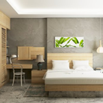
Bedroom Nook
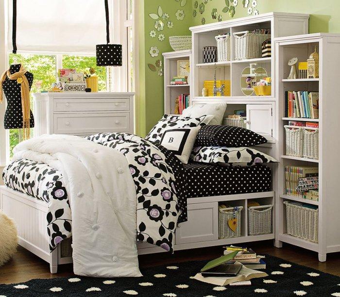
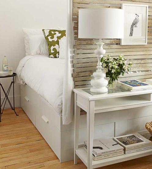
Caleo from The Brooklyn Home Company had the idea to make a cozy, bright and inspirational room. Lyndsay Caleo believes that Ikea beds doesn’t take a lot of space. Her design partner – Fitzhugh Karol, shares the opinion that the sleeping areas should be full of light and air while being a special private space for each person.
Walk-In Closet–Size Kitchen
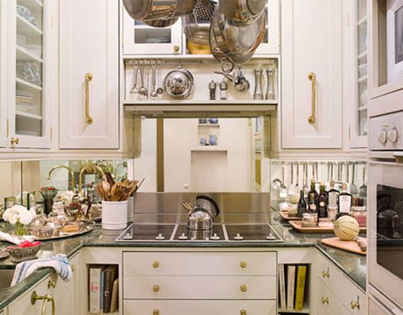
There has always been a war with small spaces and the designers are responsible for finding solutions to the space problems. It is a really hard task to fit everything in its place. In this project, the designer had to shave each element separately in order to succeed in arranging the elements in a suitable place. The marble counter tops turned out to be narrower than usual. But this is an advantage, since the designer could use the left place for other things. As a whole, she tried to use every inch that has been left unused. This requires creative thinking and inspiration for details.
Bunk Room
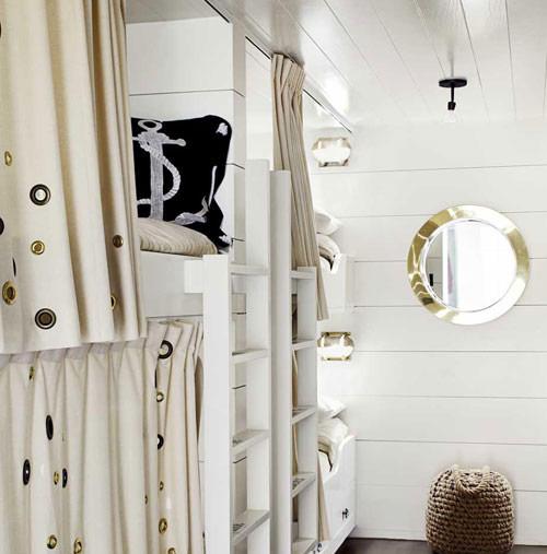
At first sight, you think that you are in the cabin of a ship. This well design small space looks amazing and very luxury. Erin Martin designed this room in California in a 1,650-square-foot luxury mansion. The interior is big fun for the kids and they love to play in the room no matter what time it is. The practical decision for the beds is comfortably well bended with the details and the colors around.You can already feel the beach inside it.
Reading Room
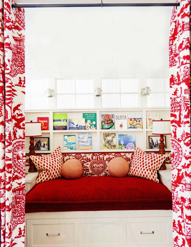
Ann Wolf created a perfect place for children who love to read books in private atmosphere where they can provoke their own imaginations. It is one colorful and comfortable place. The curtains are designed by Pierre Frey’s Alpage and they create vigorous and fresh atmosphere. The sleepover will be fun for other kids.
Brooklyn Studio
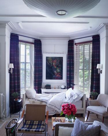
A window designer at Ralph Lauren gives the brilliant idea that one room is able to look like five. The space is well arranged in a functional manner. The colors and the light from the windows are a successful combination that supplement the furniture.
Cheerful Bathroom
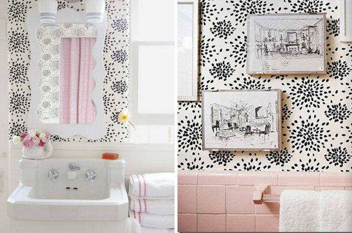
Clean and tidy small bathroom. The designer Krista Ewart chose to combine wallpapers of Hinson’s Fireworks and mirror design by Ewart. This decision resulted in a fresh and stylish, full of coziness space. The little pink details are cute and neat.
Alcove Bedroom
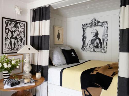
“Welcome on board” is the message that this room would have addressed you, if it was a living being. The interior is completely contemporary and comfortable. All the details are focused in one – to make you feel the ocean in your bedroom. Wisely chosen colors and furniture design ideas are projected to cover all modern conveniences. The black and white combination gives the idea for relaxation and has been used moderately.
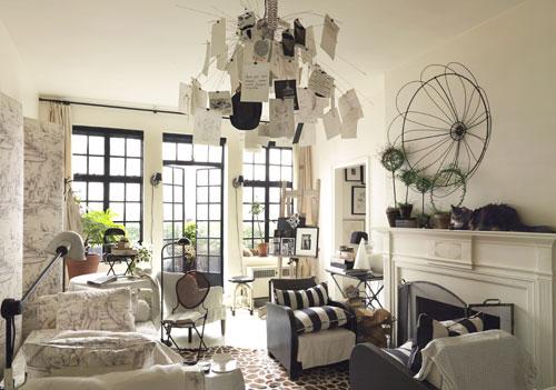
A Penthouse Studio
This one-room apartment is a 450-square-foot studio, located in New York City. You can see that every detail in the design stands out because of the clever interior decisions like the wall of windows, made by the design consultant Ellen O’Neill. By allowing more light in the room it makes its space look larger. Bright colors are clever choice for small places. Another good idea is to arrange the furniture practically. Don’t you want to sit with a glass of wine on one of these armchairs which are placed in front of the fireplace? Imagine the long and relaxing nights in this fantastic place!
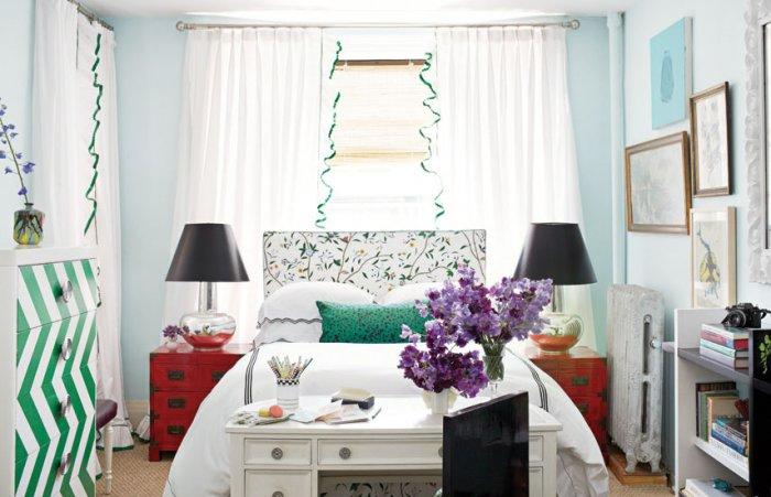
Eye-Popping Studio
It is very hard to decorate a 295-square-foot apartment. A challenge, you may say and you will be right. But designer Nick Olsen didn’t stop in front of the difficult task. He broke all the rules in designing and did a miracle. He used a soft touch of metal materials for the bedroom interior design. On the bed itself he placed a neat bed cover made of linen. To complete the concept he decided to place a lamp in one of the corners. He chose lamps which later turned out to look bigger than all the other elements in the room. But he decided that this is not a problem and used some color tricks to take the accent off the lamps. He placed them on red night drawers and the jobs was done.
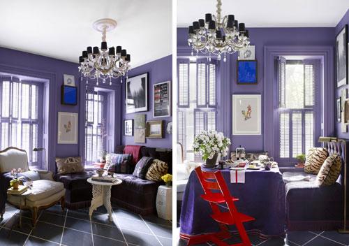
Living Room Turned Dining Room
When we use dark tones for creating a fresh and stylish interior, we have to bring more light in the room. This room doesn’t have a lot of space but the designer David Kaihoi built a corner banquette and made it very practical.The room can be transformed into a dinning room or luxury and modern living room. The colors and the furniture design complete each other.
