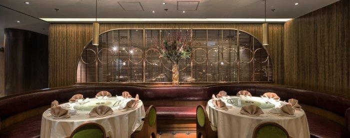
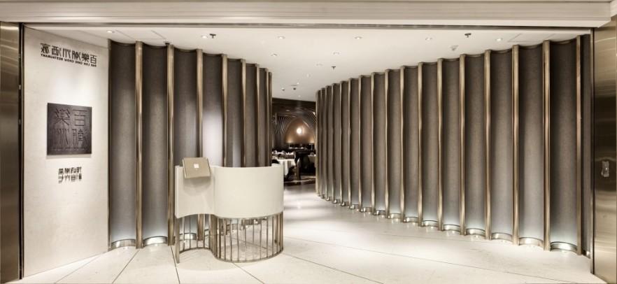
When we are arriving in the restaurant with 1960’s Hong Kong spirit, the first thing that makes an impression is a very luxurious curved passageway, created by vertical faceted brass screens. In the end of it, we are reaching the main dining room, which is covered in wood. The restaurant has two curvilinear VIP rooms that are placed on left and right side of the entrance. This allow a gradual passage that leads us from noisy mall to the cocoon like wood covered dining space area. This calm transition between these two areas provide very calm and discreet feeling to the regular customers when they enter and leave.
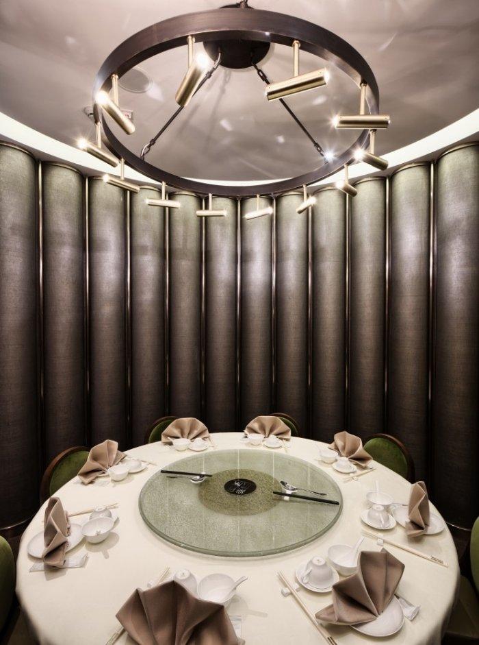
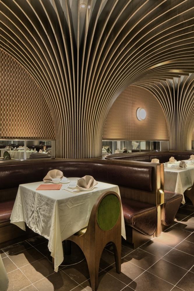
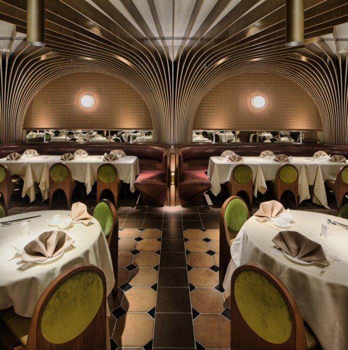
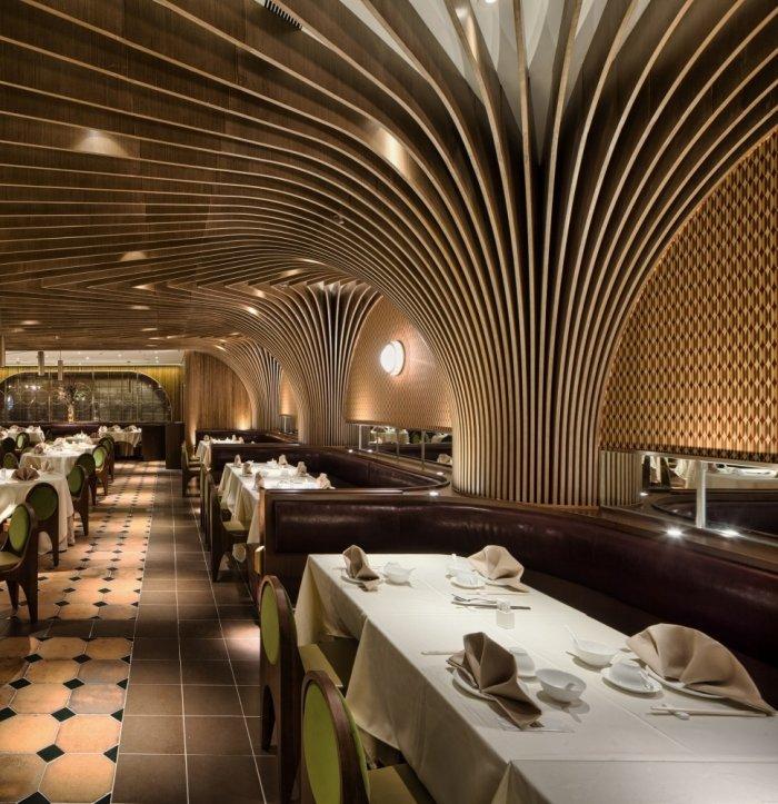
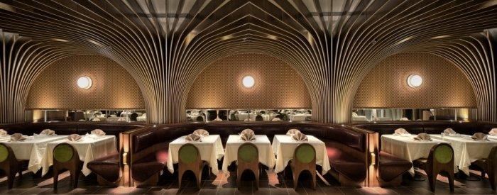
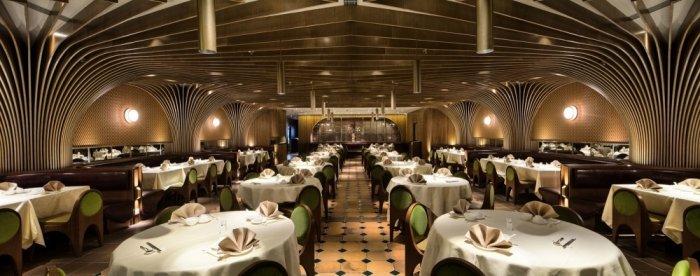
In a futuristic cutting-edge manner, the vaulted veneer walnut ceiling design of the main dining room, hints the spirit of 1960’s Hong Kong. The entire ribbed CNC milled ceiling is concealed from repeated and rotated 20 half arches at angular increments. In this spacious dining area, the levels of noise are quite low, because of the wood clad structure that has good sound absorption options. In addition to the ribbed structure, strategically are being placed also a suspended light fixtures and bespoke wall sconces, which complete the delicate framework.
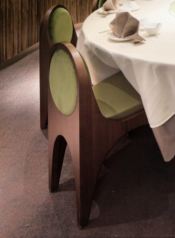
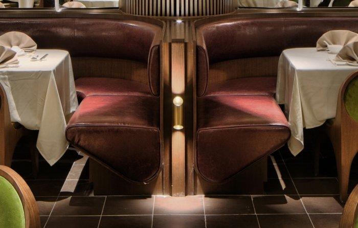
What makes the setting more comfortable and intimate? These would be the small details and materials, of course. For example, the individual table groupings are defined by the custom burgundy leather banquettes with mirrors that are horizontal and 60’s print wallpaper. Also the custom olive green velour chairs create one more intimate environment. Their design completes the ceiling and break down the scale of the space.
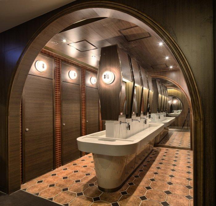
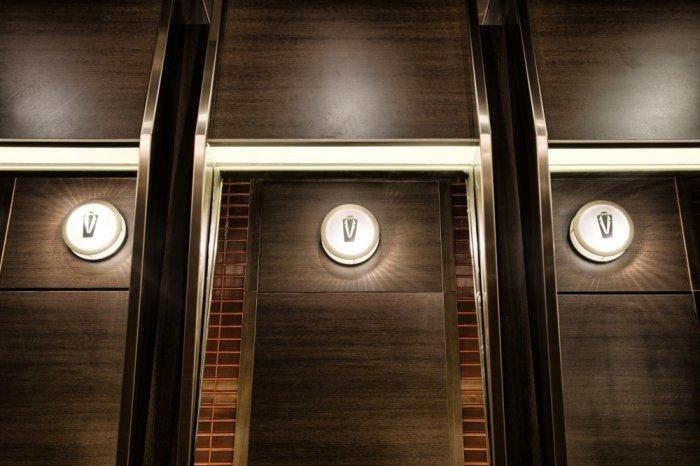
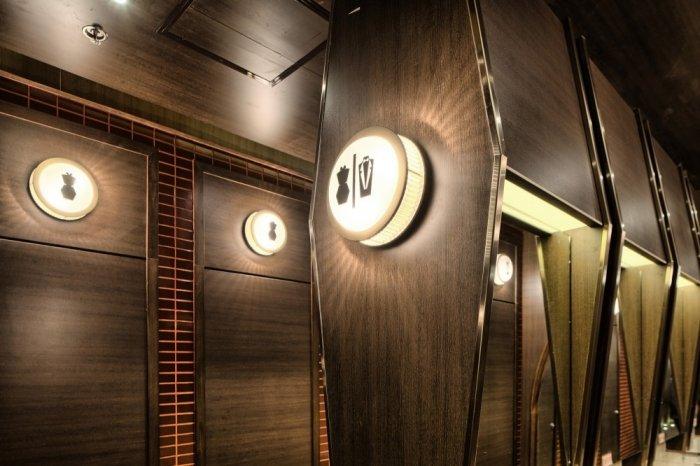
A very smart decision of the designers is that the bathrooms are located on the back. One large central communal sink separated the bathroom space into two halves (male and female). The male and female WC indicators have a very interesting design, which remains an aircraft installation. The custom backlit indicators help the clients to find more easily the corresponding toilet compartment, cladded with a distinct color tiles.
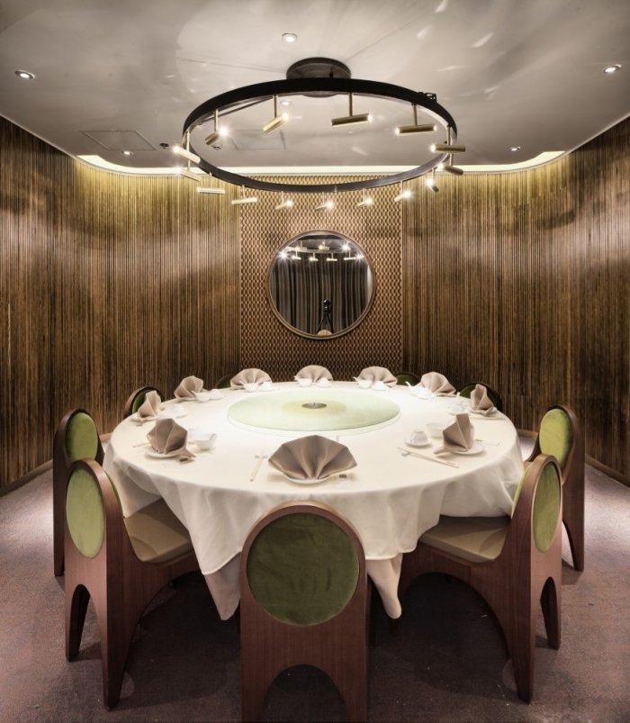
While creating this visually striking project, NCDA insists on avoiding any explicit links to the Chinese traditional design. That’s why for this restaurant we see the perfect mix of modern and classic, which create one refined and comfortable dining space. The design of Pah Lok Chiu Chow Restaurant is created in a holistic approach, as visually seams that the interior design, graphics, furniture, lighting fixtures, even staff uniforms are integrated. This highly functional modern aesthetic restaurant is defined by the mood and lightning of a space and its detailed ceiling construction.
