ABOUT ADVERTISING AND PEOPLE
The Singapore-based office of one of the leading advertising agencies in the world -Leo Burnett, presents one of the most interesting interior projects we have come across lately. We were impressed not only by its image, which is exceptional as it is, but also the fact that it is built up of a lot of symbols related to the company’s history, the company’s identity and to Leo Burnet? himself. It was designed by the Singapore-based studio Ministry of Design (MOD), whose owner and leading designer is Colin Seah.
ABOUT THE DESIGNERS
MOD’s philosophy about making a project is related to the idea about questioning, breaking up and reconsidering the forms around us and adding new meaning to them. What is important to them is that every space they design includes elements, which characterize the people who will be using it. This is determined by the fact that people are the essence and the meaning of everything they create,
ABOUT THE ADVERTISING AGENCY
Leo Burnett is among the founding fathers of advertising the way we know it today. After setting up his agency in 1935 he was acknowledged as one of the most influential people in this business. Today the company has a network of offices in more than 70 countries and is invariably among the top five award-winning advertising agencies worldwide. Some of its clients are companies such as Coca-Cola, Procter& Gamble, McDonald’s and Marlboro.
ABOUT THE PROJECT
A composition of elements which are not merely beautiful but also meaningful. A synthesis of pure lines and unique focal points A working environment characterized by an atmosphere, which stimulates creativity. This is how we can describe this exceptional office environment in short. The first thing the visitor faces in the main foyer (which the designers called Space to Impress) is the portrait of Leo Burnett. You should not visualize the standard picture in a frame, hung on the wall aiming to inspire with respect the employees. Colin Seah hired an artist to create a three-metres high picture, starting from the polished-in-white floor, going up across the entire wall with all the door and windows on it and finally reaching the ceiling. The drive with which the drawing was made expresses both the personality of the man behind the trademark and the creativity in his approach to work. The three dimensional black pencil, which Bernett is ‘holding’ in his hand, is an iconic image, which has with time turned into one of the most striking company symbols.
The walls, the floor, the ceiling and the shelves in the formal meeting room (Space to Interact) are painted bright green, which is the agency’s corporate colour. The same colour Is used to draw attention to certain focal points in the room for relaxation where the comforting white colour is predominant. One of the wails in the room is lined up with shelves with small transparent bowls full of red apples – another symbol of company identity. There is another bowl with fruit hanging from the ceiling over the reception desk. The story goes that during the Great Depression, when the company was established, all other companies were trying to cut costs while Leo Burnett was giving apples to both clients and employees as a token of integrity and loyalty.
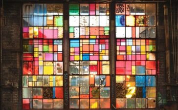
All excessive elements were removed from the Space to Create area. The austere atmosphere created by the industrial style is warmed up by the soft shades of the wooden desks, which are arranged next to each other and jointly form big working areas which stand for the collective working spirit. There is something else of interest – in the yard – on the concrete pavement and up over the fasade – we spot long black lines, which, at first sight, seem to have been drawn in a desultory manner. But if you look at them at a specific angle, they form the figure seven plus. “Advertisements are evaluated on a scale from one to ten. One stands for the worst advertising product, while everything rated seven and above is really very good. This is why 7+ is a symbol integrated in every Leo Burnett’s office worldwide,” Seath explains the reasons behind his witty decision to illustrate this typical of the company graphic symbol.


