A couple and their four children and two pets are the proud homeowners of the splendid white mansion in Minnesota. Their home has recently been renovated in a new fascinating way with refined classic touches in the interior design that added a fresh new appearance of the original building constructing in the mid 20s of 20th century. The interior designer of the project is Renée Hallberg of RLH Studio that worked in a close collaboration with the architects and contractors in order to be sure that the new home will be able to provide all the necessary possibilities for a modern life. Actually, it took the designer two years to develop the project plan properly and only two weeks to install everything inside. The result – is this gorgeous mansion in mainly white colors that is ready to welcome its occupants in their new realm.
The main entry has been preserved in its almost original state. For example, the doors and light fixtures has not been changes since they are unique. The designer repainted the existing oak floors in a darker tone and the other part has been executed with chessboard marble floor. Hallberg also installed an antique chandelier. An impressive note is made by the staircase once you enter the mansion. It is also in its original state as well as the molding and banister.
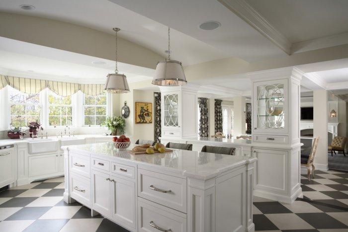
A modern open plan kitchen has been installed in the cooking area. It is very comfortable when more than a person stands there since this disposition of furniture provides a lot of space. Beautiful windows behind the sink allow enough sunlight inside the place while they charm the occupants at the same time.
On the floor, the interior designer placed porcelain tiles which is really proper material for a busy kitchen.
Large kitchen cabinets provide enough storage space for all kitchen supplies. The surface of the top reflects the scale of the mansion and allows all the members of the family to gather around the cooking sessions every Sunday morning.
Well, the designer also made a project for this two little fellows that also love to spend their hours in the kitchen. They should be extremely thankful to Renée Hallberg since she made their stay more pleasant.
Behind the kitchen, there is the breakfast area situated. Sometimes the kids do their homework there. Hallberg kept the original chairs but reupholstered them. The top of the table is also a new creation in order to match the upholstery of chairs. A beautiful wrought iron chandelier falls above the table, adding a little “castle” touch in the interior of the mansion.
The starring element in this part of the mansion is the original long German sink that previously has been placed elsewhere. It was a hard task to install it properly here, but finally Hallberg and her team made it. They are true professionals.
Wooden accents predominate in the gorgeous classic dining room. It is a mixture of the old and unique furniture and items and some new reformations made by the interior designer. Striped chairs and a Stark rug are one of those little changes that transform the entire look of the room. The corner cabinets has also been customized. Hallberg changed their background to blue and installed lighting inside.
The original mural Vues d’Amérique du Nord has been kept because you can’t simply demolish a masterpiece. Zuber et Cie is the French company that made it far ago. An interesting fact is that just the same piece of art can be found today in the White House and it is Jackie Kennedy that used it first.
Actually, the original piece had an orange sky and Hallberg didn’t want to keep that. She hired Otto Painting Design in order to transform the color from orange to blue and the company did this really professionally. The purpose was really simple. Hallberg wanted to keep the original spirit that lives in the house, while she needed this piece of art to fit in its new modern redesign.
In the family room there are also a lot of items that has been kept. For example, such kind are the chest, mirror , sofa and cocktail table. The colorful nuances follow the hues from the other room but here Hallberg introduced some really nice strawberry and yellow accents. It is a feminine touch that she wanted to achieve and she succeeded. Furthermore, a Calvin Klein rug is used on the floor and its brilliance adds an elegant style to the room.
In the living room the strict classic look is almost forgotten. Vibrant happy colors fulfill the interior with joyful charm. A camelback sofa, French chairs, bench cocktail table and lamps – all live in a perfect colorful harmony together. Of course, the hues are very reserved in order to keep the sophisticated look of the room.
Little decorative elements are able to change the entire look of a certain room corner like this one, from the image above. Have a look at the splendid buttons used on the drapes.
In the powder room you can find the obvious preferences of the homeowners towards the tile border. Hallberg had the task to make the entire room in this border. Silver leafs on the wallpaper patterns reflect the metal shine from the faucets and mirror, thus creating a coherent sequence of colors.
And now, lets head to the masculine parts of the house. It looks very much like a study from the early years of 20th century. A beautiful onyx fireplace adds an ultra modern touch in the interior. Here is where a monkey chandelier is placed – one of the most favorite homeowner’s items that has been used in their three homes before this one.
An interesting approach is to use a vintage Louis Vuitton trunk as a coffee table here. It is the sofa and its light nuance that create the focal point in the room. The rest of the interior is in dark wooden tones.
This secret place is a true paradise of spirits. It is hidden behind a secret panel door that is opened by pushing the background of the black and white retro photos. When closed, it looks very much like a part of the wall. The wallpapers inside the den are in typical Japanese style – colorful patterns of scenes from the Japanese traditional culture.
If we can sure say that the man cave is a typical masculine room, this one is just on the contrary – feminine at its finest. This is a women’s heaven for relaxation and daydreaming. The huge window facade of the mansion provides inspirational views to the outer areas full of natural greenery. In case you have such kind of corner in your house you can use one very easy and effective tip. Add a colored tape border in order to get a custom look.
A powder room in pink is nothing but a feminine paradise. Grass cloth covering the walls and shining like a perl – this is one of the most preferred rooms for the wife. A classic French vanity adds this stylish accent right in front of the mirror. Once you’ve been there and had a look at the mirror with this vanity as a reflected vision, an image of yourself in a royal composition sticks into your mind and recalls itself ever after. A custom Italian marble top is something that Hallberg managed to add.
How can you ever thought that a room of grey shades is able to be boring? The neutral colors soften the atmosphere and create a cozy, close and intimate feeling in the master bedroom. Of course, Hallberg did some changes to the original interior, like reupholstering the bench, for example, or the bed setting. The original prints have been reassigned too in order to reflect the new modern appearance of the whole mansion. Additional nightstands complete the sophisticated look of the bedroom thus turning it into a pleasant place to be. Since they provide enough place for books and other necessities, the place is an ideal getaway for a pleasant evening with a romantic book in the homeowner’s chamber.
In the master bedroom the changes were far more complex. The architects from Cook Architectural Design Studio made one of the biggest reconstruction changes in the house. They created a brand new barrel ceiling with Venetian plaster. It is a true masterpiece in classic style that matches just brilliantly with the rest of the emotion inside the mansion. As you already have noticed, mirrors are something essential in this home. The master bathroom is not an exception, since a beautiful Venetian mirror is hanged above the vanity.
Some simple additional items can always add the desired feel in a certain place. Take this elegant chandeliers, for example. They are a top finding at Vintage Pine in Chicago.
The kids are lucky fellows. They have their own small cozy paradise in this beautiful mansion. One of the rooms is a study and bedroom at the same time. Actually, it provides everything for a funny childhood.
And this is the little girl’s paradise. She feels like a princess in this classic girlish interior. Vibrant happy colors and a painting by Otto Painting are the special accents that grab the attention. Another great feature in the girl’s bedroom are the shiny little stars on the sky, pardon us, the ceiling.
So what do you think? Do you want living in such a paradise? Feel free to share your opinion in the comments section below.


