Project name: The Black Office
Company name: Studio-A29
Website: http://studio-a29.squarespace.com/
Contact e-mail: [email protected]
Project location: Rijeka, Croatia
Completion Year: 2017
Category: Office space
Photo credits: Nel Pavletić Gorički
Project Description:
How to design a 100 m2 office in the city center of Rijeka, Croatia, where you feel like at home, was a challenge faced by the Croatian-Italian architectural office Studio-A29. When you have a request like that, taking a classical office idea, room with four walls and tables, will not meet the clients expectations.
Space is facing north and illuminated with the neutral light throughout the day and year; it was natural to try to create a design that would allow the penetration of light in every single corner of the office.
The first step was to knock down all the partition walls, leaving only the beams and columns that carry the structure and the existing sanitary block.
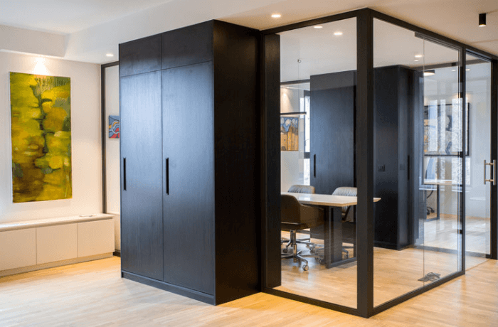
It started with the concept of three black volumes. One volume was identified through the existing sanitary block, while the other two were created in the form of custom furniture wrapped around the pillars hiding those same pillars and dividing the entire space into three zones.
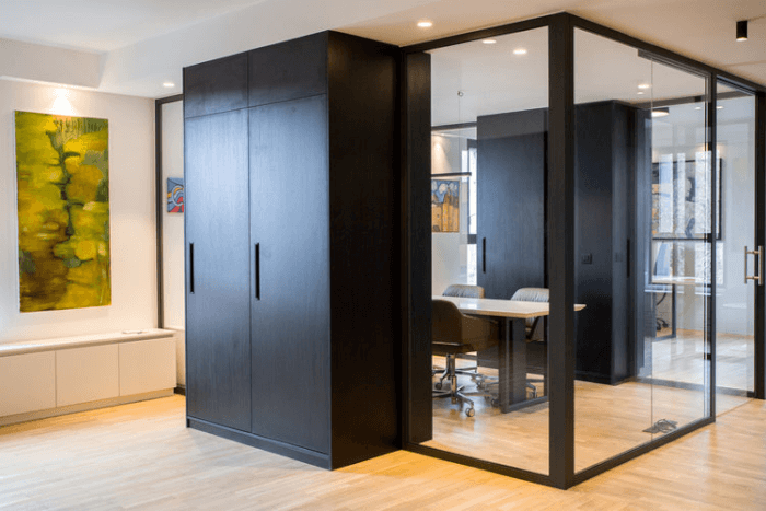
The first zone is dedicated to the reception with a lounge area and a kitchen that is visually integrated into the volume of a sanitary block.
The second zone is devoted to a meeting room, a transparent glass volume, which size is determined by two black closets (two new volumes) that are in contrast with the black volume of the sanitary block. This part also stands out because of the lower ceiling that gives the whole space rhythm (higher-lower-high) and emphasizes its hierarchy.
The third zone is dedicated to working office area strategically positioned to maintain privacy while the use of glass partitions still ensures the fluidity and the visual openness of the space. It also gives the feeling that there is no partition walls or doors in the entire office.
A demanding design aspect was related to the installations. To hide them an element of plaster was made on the ceiling while on the floor was placed a low cabinet with the identical role, hiding the installation and heating elements, and visually and physically connecting the entire space.
Another challenge was to persuade the clients to use black oak as a coating for the three volumes. Despite initial skepticism, clients decided to trust the architects and their belief that black color at the same time has a value of elegance and seriousness and gives a different sense of dimension, proportions, and relationships with the light.
It is important to emphasize that everything apart from the chairs and lighting was custom designed and made to maximize the function and maintain control in the Design aesthetics. Details like these are the ones that make the difference, but also the architect’s vision of looking at the interior as an architecture allowing each element to express its identity and thus become timeless.
And finally, one should not forget about the crucial function of the clients. They understood the role and potential of the architects by giving them the necessary freedom and being actively involved in the whole process.

