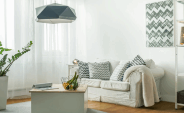
Spring is almost here and that means only one thing. Pantone’s colour report is already out offering an eclectic mixture of simplistic and nature inspired shades and motifs. This season, there is a clear shift towards cooler and softer tones. This spring will be anything but boring when the gorgeous mellow brights, earthy neutrals and paler pastels step in. The trends are inspired by the reminiscence of simpler times. The delightful retro vibes, floral and folklore elements as well as the tropical landscape themes remind us of the upcoming warmer months.
The beautiful blend between cool and subtle lively tones evokes soothing and relaxing mood. It uncovers the need of escape from the frenzy of the everyday life. The stylish colour palette can be easily translated in the home interior. Use the shades to create statement or to revamp completely your home.
Aquamarine
This spring leave the “blues “only for your interior. You can see different variations of the rather coldish colour, but aquamarine takes the first place. The calming and airy colour dominates not only the woman fashion collections for the Spring/Summer 2015, but also the home decor trends. The dreamy and cheery shade will please your eyes and will reduce your stress right away. Seating in aquamarine will complement perfectly a darker room. Be careful with the upholstery. The cleaning will be tough with this light tone.
Scuba Blue
The turquoise is another playful and invigorating version of the blue wave. Although it is in the cool side of the spectrum, it brings effervescent and up – beat feeling. The bold shade will immediately give statement to your interior. You can incorporate it in different ways – as wallpaper, upholstery, throw pillows or other small detail. Again, you need to be mindful about the scuba blue furniture, because you might have difficulties cleaning it. Otherwise, the delicate tone will remind you of the serene summer sky.
Classic Blue
While on the “blue” topic, here is a classic tone that makes a huge come – back this spring. Sophisticated and introspective, this colour recalls the deep and mysterious sea. You can literally use it everywhere – from the wall paint to the simple rug. The classic blue goes particularly well this year most popular colour – Marsala. Combine these two for chic and dashing design.
Tangerine
Brighten up the room with some tangerine additions. Painting up the whole place orangey might be too much, but it’s totally appropriate for your couch. A little disclaimer: avoid staining this type of furniture or soon enough you will need upholstery cleaning. Tangerine will energize your interior, creating fun and friendly environment. You can pair it with another fashionable colour – roasted almond.
Custard
Joyful and comforting, custard is another nature – inspired tone. If you are not brave enough, get small accessories that can serve as accents. The bedding is a perfect starting point. Looking for some contrast? Try the classic blue and custard combo.
Toasted Almond
Use this sun – tanned shade as a base colour in your living room. Generally the neutrals provide the possibility to create layers, because they go well with almost everything. The toasted almond is not an exception. Cosy and classy, this tone will reflect the natural daylight creating a homey atmosphere.
Click here for more house cleaning and maintennace related info.
Founterior.com > Design > The Hot Colour Trends of Spring 2015
Leave a reply


