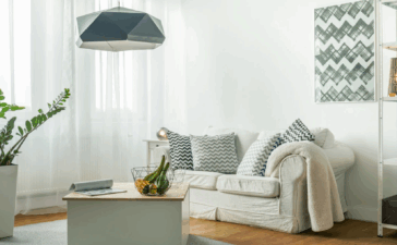
Balance is everything in design. When you walk into a building, room, or home, you notice immediately whether the space is well-balanced before deciding if it’s well designed. All artists use this concept in their works, so it’s essential to grasp it to imitate its success. Let’s take a brief look at the principle of balance in interior design and what it can do for your home.
What is The Principle of Balance?
Whether we’re aware of it or not, we all understand the importance of balance. Balance implies physical equilibrium: where one half of the object imitates the other half. In an aesthetic sense, it is pleasing to our senses and gives us an emotional calmness. From a young age, we understand that if something isn’t balanced, it will fall over or go sideways.
Without balance, many things stop working. We wouldn’t be able to ride our bikes, stack blocks, stand on our feet, or achieve a stable lifestyle without this concept. That’s well and good but, how does balance translate into the artistic sphere of interior design?
The Towel Example
Say you place a 5 piece timeless decor towel set from Versace on your towel hanger. There’s one large towel, two medium towels, and two small towels. If I placed the two medium towels side by side, both folded in the same rectangle, I would achieve symmetrical balance. Both towels have the same visual weight, look, and distance and are therefore wholly balanced.
Different Types of Balance
While the towel example demonstrates symmetrical balance, that only scratches the surface for objects that can achieve harmony without being a similar object. There are also other ways to achieve balance in interior design, such as asymmetrical and radial.
Symmetrical Balance
Symmetrical balance is the easiest to obtain and understand with the naked eye because it’s the process of making a mirror image. It’s a great tool to create visual pairs. Many bedrooms have symmetry without trying because they usually have furniture accents like a large bed and two night tables on each side. Symmetry is also commonly found in nature.
Our own bodies are even symmetrical with some outliers, but most humans have two eyes, two arms, two legs, and two lungs. In interior design, artists will portray stability through symmetrical balance but, the room could be too dull or unimaginative if done incorrectly. One way to break that pattern is by adding the same style of chair with a different color seat.
Asymmetrical Balance
Asymmetrical balance is more tricky to master and understand with our eyes because it may not be apparent immediately. You need to get creative when you show asymmetry in design and not make the mistake of producing chaos. To achieve asymmetrical balance, try to use items that share some similarities, like color and height, but placing them in an orthodox way.
Complex shapes will feel heavier, which is usually why they’re used in asymmetrical design elements. When walking inside an asymmetrically balanced room, you may feel weird, but as you scan the design elements, you’ll notice a dynamic flare that’s less rigid and more unique. To truly pull asymmetry off, you really need to have a special eye for design.
Radial Balance
Radial balance is the least used but easiest to capitalize if you have the space for it. The most modern example of radial balance is through mandalas, a Hinduism and Buddhism symbol that’s more commonly found in coloring books in America. The North Rose Window of Chartres Cathedral is another effortless example of radial balance.
Radial balance is almost circular as its distributed elements revolve around a central point and extend outwards. In an office, a central table may be used for meetings so your boss can hear everyone. Its purpose isn’t solely for looks as a radial balanced room can encourage communication between more people without straining our voices or standing up.


