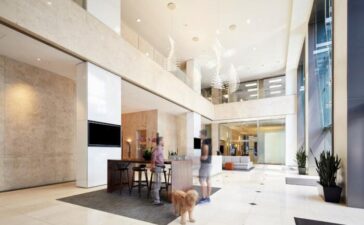
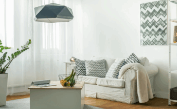
Mid-century modern designs feature a unique, retro appeal that’s assembled with a balance of organic and manufactured colors and building materials. The design style hails from the 1950s, though it’s still a popular choice for today’s new homes and remodels. Are you interested in including mid-century modern designs in your space? The top interior designers in your area can help you learn more about this process.
The minimalism and high-functioning design of the mid-century modern space were created to complement living in a post-war era when the movement toward suburban living was continuing to grow. Many of the colors and furnishing styles are drawn directly from Bauhaus designs. However, these designs can still match the demands of today’s modern lifestyle as well as any home design.
Key Characteristics of Mid-Century Modernism
Mid-century modernism features distinctive characteristics that set it apart from other forms of modernism and contemporary design. Where other styles focus first on aesthetic and visual appeal, the mid-century interior places a more direct emphasis on functionality and durability. Here are a few of the other key characteristics of mid-century modernism that give home and office interiors a distinctive flair.
Mixed Building Materials
Furnishings and decor pieces within the mid-century modern arrangement are not bound by a single material, but most frequently use teak as a foundational building element, particularly for chairs, couches, and tables. In some cases, mixing building materials can result in a somewhat eclectic or dated appearance. For this reason, many homeowners that research mid-century designs find it easier to hire a professional interior designer who can ensure that the room maintains a timeless quality throughout.
Neutral Color Foundation With Bold Accents
The primary foundational colors for the mid-century modern space are white, grey, and tan, all three of which are somewhat neutral in terms of temperature. Cooler colors, such as blue, are less standard for these spaces, though not without their uses. Bolder color accents are common for the room’s statement pieces, such as individual chairs, coffee tables, or wall decorations. In terms of color palette overall, the mid-century space might seem somewhat eclectic on paper. However, the design offers a uniquely cohesive visual experience when properly executed.
High-Functioning Elements
Functionality is at the center of the mid-century design philosophy. Ornate detailing is kept to a minimum wherever possible, while superfluous items are generally eliminated. The design as, a whole, highlights the build quality of the home’s key centerpieces, such as the cabinetry, countertops, and furnishings. As a homeowner, that also means you’ll need to carefully look after these central elements and keep their surrounding area clean.
Minimalism
While minimalist principles are typically a philosophy the modern designer considers in conjunction with Scandinavian design, the theories of concepts of keeping the home as clutter-free as possible come from Bauhaus design– a parent of the mid-century modern design that rose to popularity in the 1930s and 40s.
Clean lines and clutter-free spaces allow the individual elements of a space to shine rather than the collective effect they create. Minimalism also assists in keeping the mid-century modern layout from appearing dated when applied in today’s homes. Where the execution of a minimalist design varies in its colors and the quality of its furnishings- both of which help to set the mid-century design apart from its other similar counterparts.
Statement Lighting and Furnishings
Mid-century modern designs showcase a range of truly unique furniture pieces. Even in the 21st century, mid-century modern pieces are a solid choice for increasing the functionality and durability of your entire space. Chairs, tables, and wall art are all components of the space that can highlight the unique qualities of what was once a futuristic design. Light fixtures for kitchens and living rooms are also an opportunity to add what essentially functions as a modern art piece to the space.
An Abundance of Natural Light
An abundance of natural light is essential to many design styles, but it’s critical to the mid-century modern arrangement. The open architecture of the space necessitates the inclusion of as much natural light as possible to avoid the appearance of the space from becoming too cold. Natural light also helps accentuate the collection of colors and textures within the space so that they stand on their own as individual design elements.
Plants and Greenery
Potted plants and greenery are a fantastic option for decorating the corners and tabletops in mid-century modern space. These décor items also help to introduce unique colors, oxygenate the room, and establish a natural tone for the space. While this might seem like a small addition to the space, it also helps prevent it from becoming too stale or dated in appearance.
A Creative Balance of Design Elements
Mid-century modern designs showcase a distinctive balance of somewhat eclectic elements that still manage to create a cohesive, modern design. While the style no longer appears as futuristic and contemporary as it once did, it’s still a standout choice for decorating a range of interior spaces. However, due to the complexity of arrangements, many homeowners choose to work with a professional interior designer to ensure the room is both comfortable and timeless.
Conclusion- What is Mid-Century Modern Design?
Mid-century modern design is a distinct retro style that prioritizes functionality over visual aesthetics. While it reached its peak in terms of popularity during the middle to late stages of the 1950s, it’s an undeniably unique option for decorating your contemporary spaces.


