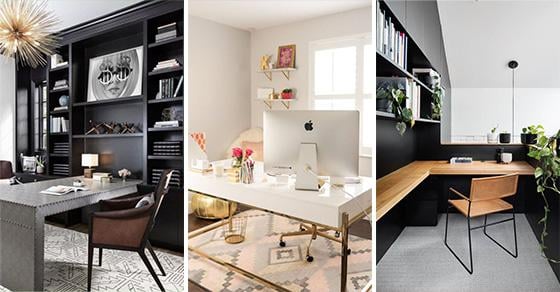
Are you going to be refurbishing your home? Perhaps you need a small space in which you can work or study. In other words, a home office. Thanks to a home office, you will be able to work and focus in a peaceful and quiet atmosphere. Or maybe you are going to redesign an office at your workplace and you are in need of ideas. Naturally, a lot depends on what sort of ambience you’d like to set in your modern home office design. So choosing the right colours as well as the right furniture is crucial. So how about you take a look through our 25 home office interior design ideas to find some inspiration?
1. Elegant and Simplistic – Modern Home Office Design
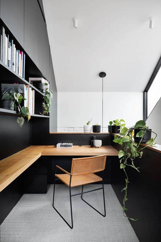
Perhaps you would like to create an elegant yet simplistic office space. If so, you can try out a simple colour combination, such as black and white. Using neutral tones will make an environment perfect for working in it. If you want to add a few different coloured elements to the office as well, why not try out wood? Using wood is a perfect option for furniture in a black and white room. Another fabulous idea is to add a few bursts of green to your office. A simple way you can achieve this is by arranging some potplants in it.
2. A Lot of Light – Open and Bright
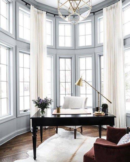
A great idea for an office is to make sure that there is plenty of light in it. By this, we mean either natural or artificial light. After all, you want to see what you are working on or reading. So you might decide on getting yourself a room which has a few windows, creating a bright and open space. An open and spacious office might actually help you feel more creative or inspired. Naturally, if you don’t have enough windows in the room to let in enough light, then make sure you have enough lighting installed.
3. White with Metal Accents – Stylish and Glamorous
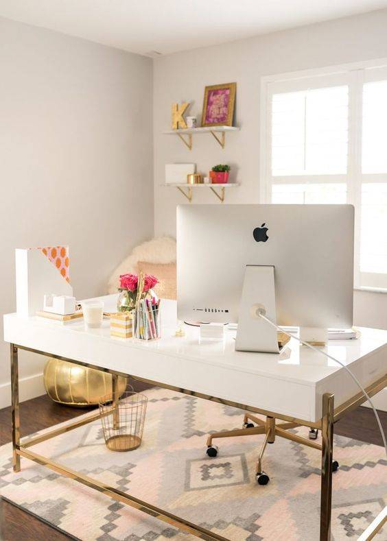
There are a lot of ways you can add a bit of sophistication as well as glamour to your office. So if this is the direction you’d like to head towards, then why not use a few metal elements? For example, you can paint your room in a simple and plain white. Even the furniture you choose for your office can be white, but how about having metal accents on them? We’re talking about the legs of a desk or chair or even a bin next to your desk. Depending on your style, you might opt for rose gold, gold, copper or silver-coloured accents.
4. Enough Shelves and Drawers – Home Office Interior Design Ideas
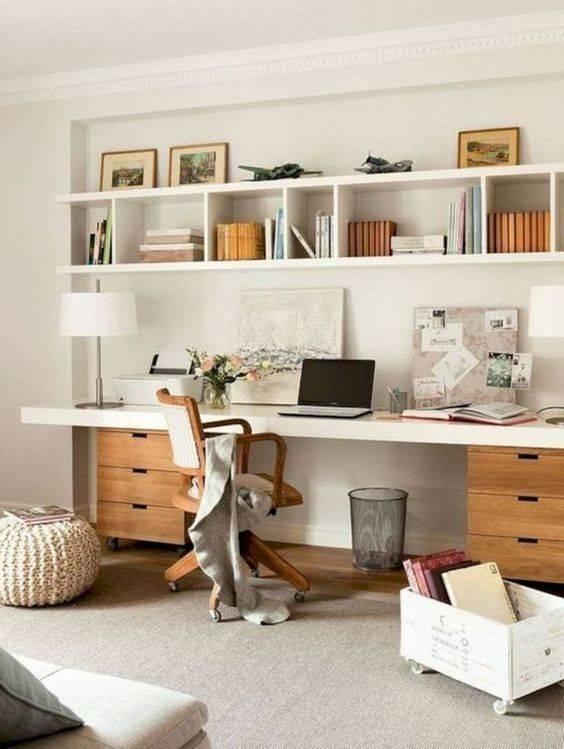
When you are in the process of designing an office, there are quite a few things you will want to watch out for. Just one of these is that you will want enough shelves and drawers to store any folders or documents in. You can install drawers underneath your desk. But if you don’t have enough space for drawers, then another option is to add enough shelves above your desk or around your office. Floating shelves are always a great solution if you’re short on room, but are also in desperate need of storage space.
5. Refined in Black – Bold and Classy

If you want to make a bold yet classy choice for your office, then why not use the colour black for your furniture? Of course, you can also paint the walls black or in a dark grey. But make sure to leave the ceiling and floor in lighter shades, in order to create a bit of space. Turning everything black would give the room a cramped and cluttered ambience. Arranging black furniture in your office though will certainly transform it into an elegant and refined environment.
6. A Desk in the Middle – Perfect for Clients
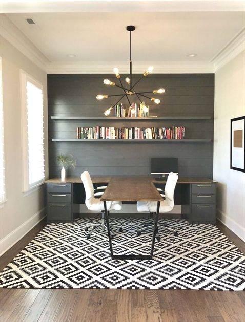
Do you tend to have a lot of clients or people stop by your office? Or perhaps you work with someone else. Either way, you will want to make enough room not only for yourself but for the other person as well. This might come in the form of placing a desk in the very middle of your room. Place a seat on both sides of the desk, making it a perfect spot for work or for welcoming clients into your office.
7. Organic Materials – A Sense of Nature
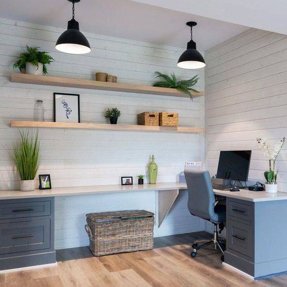
Maybe you love using organic and natural materials when it comes to home design. This might come in the form of using only wooden furniture. Or a woven basket as an alternative to a rubbish bin. You can even store some of your office necessities in some boxes made of bamboo, there are endless options! To bring even more life into your office, you can arrange some potplants on your floating shelves or desk. Adding a bit of nature to your office will improve the overall vibe of the room.
8. Connecting Two Work Spaces – Home Office Interior Design Ideas
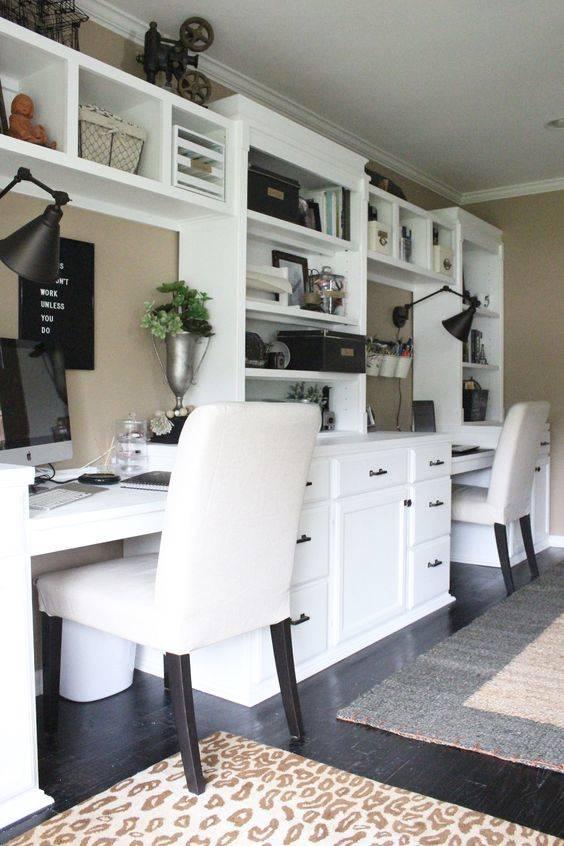
Do you work with someone else at home? Then transform one of the rooms of your house or apartment into a place where both of you will fit comfortably. How about connecting two desks to each other, connecting them with the help of a few shelves or drawers? You can line one of your walls with two desks which are connected by the set of shelves. This is a perfect sort of arrangement for a room that is wide. So if you have been in search of a modern home office design for not only one, but two people, then you might give this idea a try!
9. For a Small Space – How to Fit Everything In
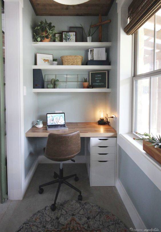
If you only have a small space to design an office in, then you might be wondering about how to fit everything inside. Even if the space you have is a smaller corner, trust us, there are endless options on how to give your mini office an amazing design! You can fit in a smaller desk in any corner of your home. If you can’t fit in any drawers, however, a great alternative is to build upwards. Installing floating shelves above your desk will be a fantastic way of adding storage space to your tiny office.
10. A Stylish Centrepiece – Modern Home Office Design
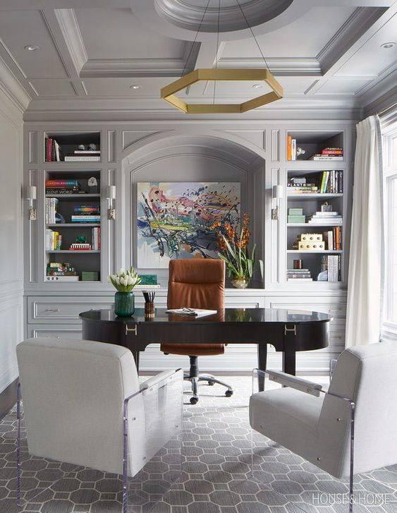
Are you in search of ways on how to decorate your office in a beautiful manner? How about you add a gorgeous centrepiece to it, which will attract anyone’s attention immediately, as they step inside? This might simply mean hanging a painting in the middle of one of the walls, right behind your desk. Or placing a large vase of flowers on a centre shelf. There are dozens of fabulous ways in which you can decorate an office.
11. Navy Blue, White and Brown – A Gorgeous Combination
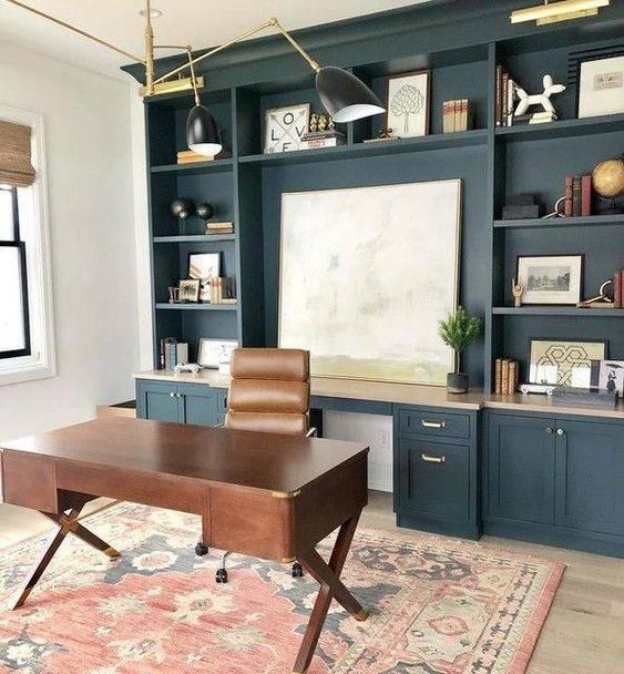
There are a few colour combinations that will bring a peaceful and professional atmosphere to your office. After all, that’s probably exactly what you’d like your office to look like, in one word, professional. Use white to paint the walls and ceiling in. Then use a combination of navy blue and natural wood furniture to achieve this sense of style. Naturally, you can add a few differently coloured elements to the office, to give it a few other bursts of colour.
12. A Unique Chandelier – Unusual and Different
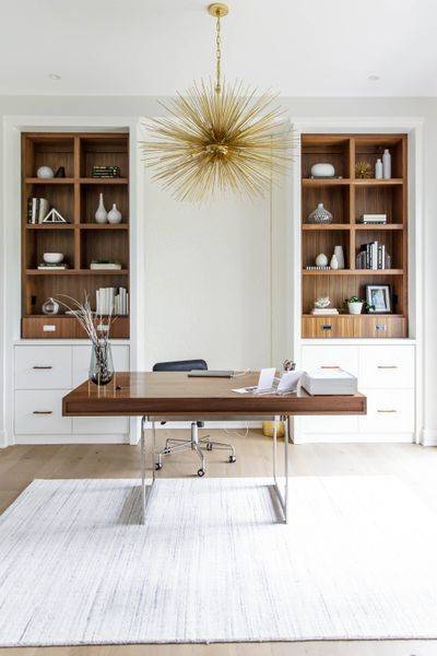
As we mentioned before, there are so many ways to add a bit of decoration and beauty to an office. You don’t have to take it overboard, but adding some sorts of ornaments will make it a better and more pleasing environment to work in. A stylish way of adding colour and depth to your room is by hanging a chandelier from the ceiling of your room. You don’t have to opt for an old-fashioned, crystal chandelier. For example, you can try out a modern shape. Not to mention, a chandelier won’t take up any space in your office.
13. A Minimalist Essence – Home Office Interior Design Ideas

Perhaps you have been in search of modern and contemporary office design for your home. You can try out a minimalist design. Minimalist designs usually work with clean shapes and forms. These will make the office look clean and simplistic. Keeping that in mind, you can have floating shelves installed above your desk, made out of the same material and colour as your desk. The shelves can even be the same size as your desk, to keep it even more minimalist. You don’t need to overdecorate your office, since minimalism is all about keeping things effortlessly simplistic.
14. Brick and Wood – A Rustic Vibe
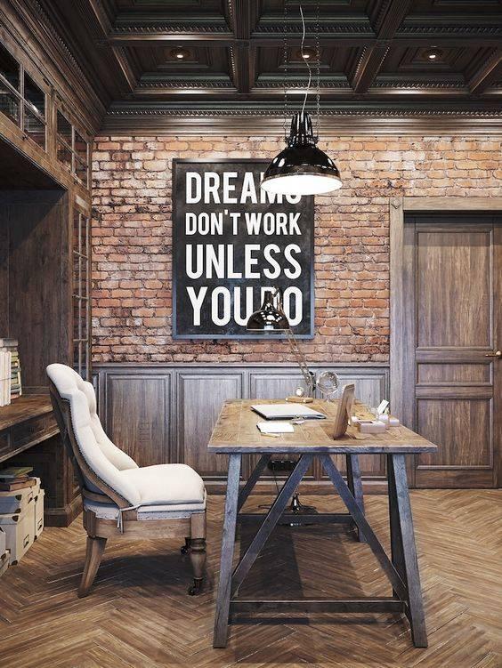
For a more rustic or even industrial ambience, why not use a combination of bricks and wood for your office design? You can use brick-themed wallpaper for the walls with wooden accents lining them. Using wooden furniture will give the office a stylish and somewhat rustic look. If you add a few metal elements to the room, such as lamps, then it can transform the whole office’s ambience into an industrial.
15. Getting Groovy – Modern Home Office Design
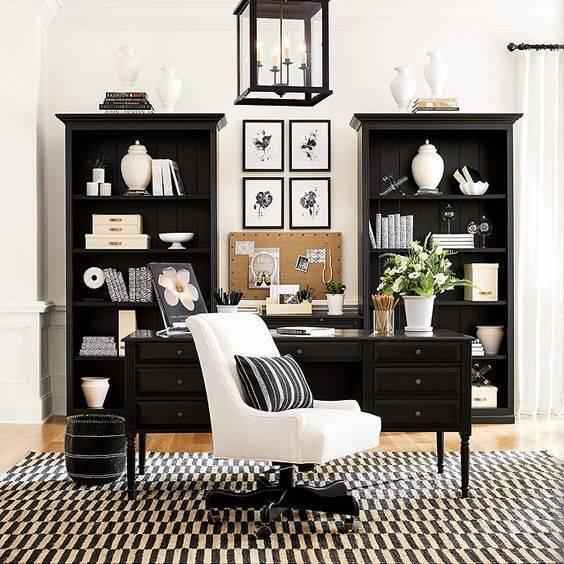
Sometimes all you need to do to your office is add a bit of funk! Especially, if you are bored with plain and simple designs. By adding just a rug with a groovy pattern, you can immediately transform your office into a fun and fabulous space to be in. This is a perfect idea for anyone who is craving to add some spontaneity and spunk to their office.
16. Surrounded by a Desk – Home Office Interior Design Ideas
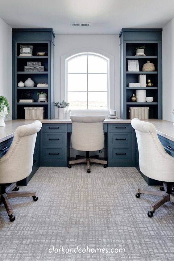
Even if you have a small office that you have to divide between one or more people, there are some smart ways of arranging the furniture. With a clever furniture arrangement, you can save space as well as making sure that everyone fits! A great idea is to line the walls of the room with a long desk. Everyone can sit in front of a different wall, this way, everyone will have a space of their own.
17. Glass Walls – Perfect in an Office Building
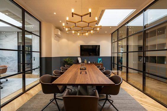
Maybe you are searching for a design for an actual office building. If you want to add an interesting element to a meeting room or office, you can try out glass walls. This will make it a lot easier to see whether there’s anyone in the meeting room, so you don’t disturb them. It’s a practical choice, but at the same time, won’t grant much privacy.
18. A Colourful Chair – Add a Burst of Colour
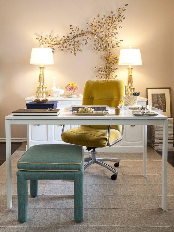
If your office is designed and styled using mainly pale colours, you might decide on throwing in a burst of colour. Add an element to the office, such as a vibrant chair or desk, to make the whole room pop!
19. Homely and Cosy – A Welcoming Vibe
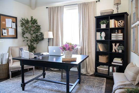
Of course, you might like to give your office a homely and cosy vibe. If so, make sure to add some personal items to your office. Just a few tidbits such as a painting or a pinboard filled with notes might make you feel more comfortable in your office.
20. A Smart Look – Modern Home Office Design
Do you love to travel and learn about new cultures? How about you express this in your office as well? Hang a map of the world on one of the walls of your office. This will definitely give the room a smart look.
21. Keeping It Simple – Home Office Interior Design Ideas
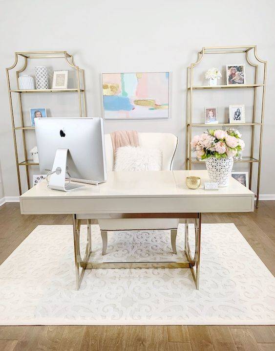
When designing your home office, you don’t need to overdo it. Keep things simple. For example, use a simpler colour combination for decorating the room. Or don’t overfill or cramp the office with furniture. Sometimes less is more!
22. Creative with Wood – Simple yet Sophisticated
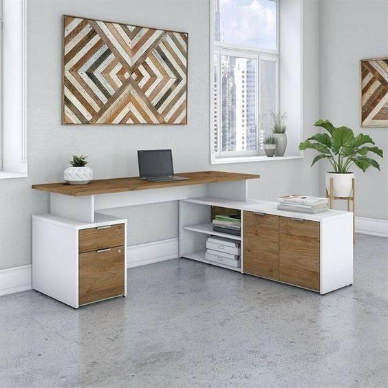
There are so many materials you can use for the furniture as well as the decorations of your office. A great choice would be to stick to wood. While it’s a fantastic option for furniture, you can also use it in many ways to decorate your office with!
23. A Desk with Style – Funky and Fun
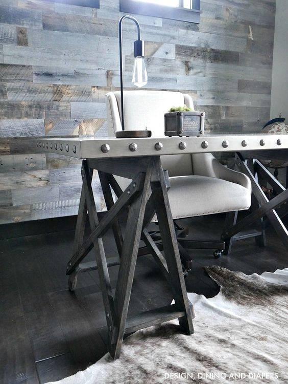
Sometimes it’s enough to choose a different and interesting piece of furniture, with which you can spruce up the whole office. For example, a desk with personality would immediately give your whole office a different ambience. This is a good lesson to remember that even the smallest details matter!
24. Shades of Monochrome – Sharp and Chic
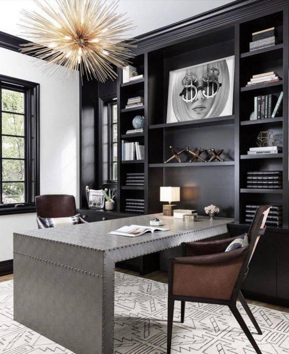
For a sleek and chic style, you might decide on using all sorts of shades of grey to decorate your office with. Ranging from white to greys to black, you will be able to achieve a super stylish look!
25. For a Larger Office – Modern Home Office Design
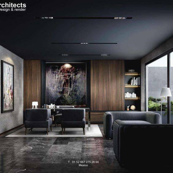
If you have a larger office, you might as well add a few comfortable seats to it. This way, if you’ve finished a meeting with a client, you can have them sit down and drink a coffee. Or it will make the perfect space to relax a bit!
We trust that you liked these home office interior design ideas. For other home design ideas, such as the best lighting for bathrooms or bathroom wall shelves, then visit our website!

