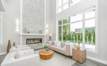
Let’s start to think about cottages and what often comes to mind? A small shingled homes which are near to the coast, full with stripes or floral prints. We could find also hand-me-down furniture or bunch of wicker and even few too many themed tchotchkes. Let us admit that 1990s attempts for a Shabby Chic don’t look so well lately so we will share with you some great ways to update and streamline your cottage’s charm. Here are few great ways to de-shabbify the chic part!
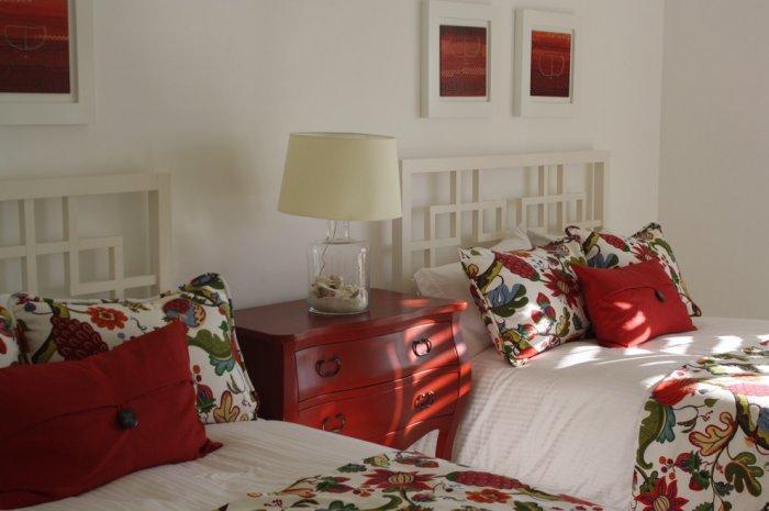
Bet on one bold sweet floral print. In this room the design is botanical but also uses one bolder print. The other parts of the room are influenced by the red in the fabric and a balance is kept thanks to the white modern headboards, framing mats and walls. The trick is to combine white + one strong accent color + one strong pattern and it is just simple!
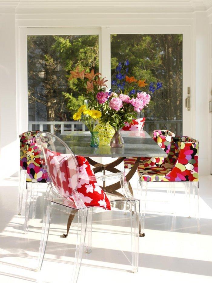
Here this stylish vibrant Missoni fabric (http://www.safariliving.com/textiles/missoni-home) replaces the old-fashioned floral patterns. We observe the perfect balance between the new and old thanks to the contemporary chairs which are in combination with flea-market looking table.
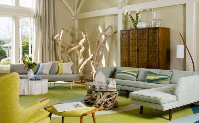
Add one inspiration from the coast but make sure to tone it down. Another great combination is the coastal color palette and textures and mid-century contemporary furnishings. As you may see we have one fresh modern look which is comfort and spacious.
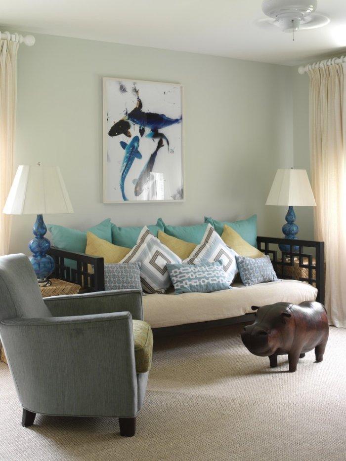
Here we can see geometric patterns in combination with coastal palette. A great balance is achieved between the color of the gourd lamps, artwork and neutral window treatments, carpeting and walls.
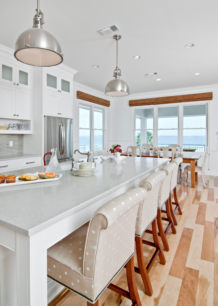
The design need to be tailored and crisp but without to lose the comfort. For example the upholstered comfortable barstools with fun polka dot print are also much tailored with the atmosphere. The things become sleeker because of the white elements in the kitchen while the cottage spirit stays alive thanks to the wooden plank.
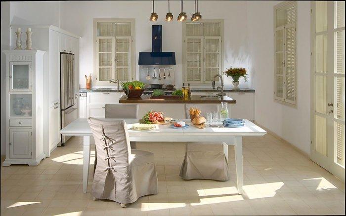
We can feel one Scandinavian touch in the dining area. The atmosphere looks streamlined and comfortable because of the slipcovers on the Parson’s chairs (http://www.walmart.com/c/kp/parsons-chairs).
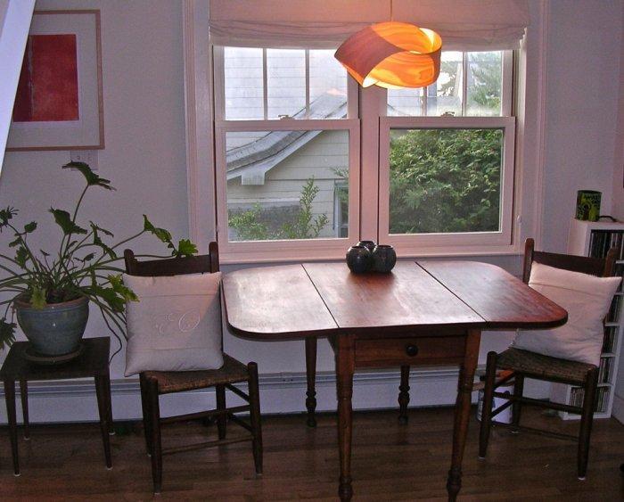
Combine the new and old. The modern light fixture and modern art are mixed with Grandma Mimi’s drop-leaf table.
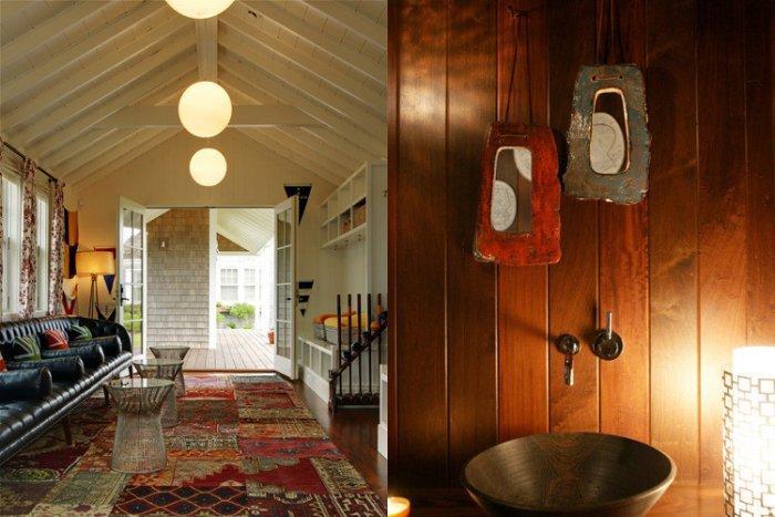
Here is one actualized look of a cottage where old is mixed with sleeker items. A regency lighthangs in contrast of wood paneled wall and also well-worn rug is combined with iconic Platner tables (http://www.knoll.com/product/platner-side-table).
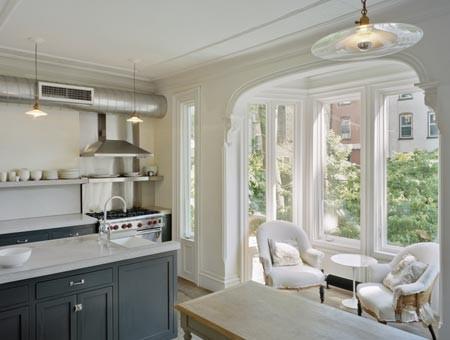
The most easy and good-looking in the same time idea is to paint in white and to let the light in as much as you can. For example these unadorned windows, which are bathing this kitchen in natural light.
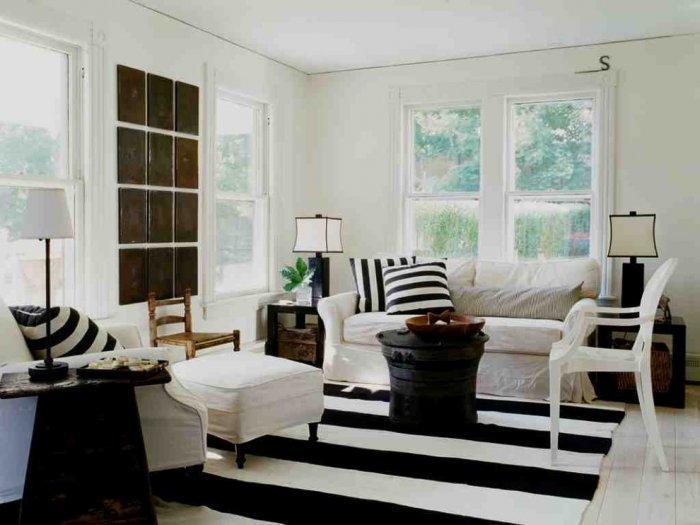
Another good idea will be to bet on graphic black-and-white color palette. If you are looking for cozy cottage style, a good idea will be the comfy overstuffed furniture.
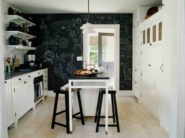
As most of us know, the cottage kitchens are most of the time tiny and require more smart storage solutions, where the things are kept simple. As the kitchen on the picture, which is the black-and-white palette and also there is a small place for fun with the chalkboard wall.
Another great idea is to update your cabinetry. For one more streamlined look, you can choose white paneled drawers and doors, where the refrigerator could be hide.
Very important tip is to use few colors. The look of this room is up to date thanks to the perfect combination of cottage accessories and unadorned windows, strict color palette and light wood plank walls that also create the comfy feeling.
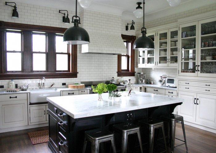
Why not to try a vintage-modern mix? This style is achieved thanks to the pantry cabinetry, subway tile, wood trim around the windows, classic modern stools and the light fixtures.
In contrast of the previous photo this kitchen with vintage-modern touches is applied with a lighter hand. The kitchen looks very fresh and streamlined thanks to the light-colored counters, cabinets and tiles. The kitchen has also a spot where the modern chef could find recipes online. We observe one cottage personality added by the bin pulls, mid-century café chair, schoolhouse lights and other cabinet hardware.
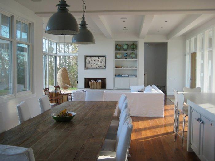
For a cottage touch there are white ceiling beams and walls. A texture is added by the rattan hanging chair and industrial lights. For one natural look we observe the wood table and floors.
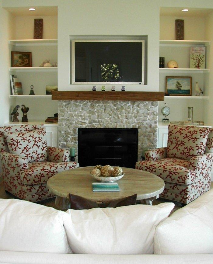
The design in this room is differing with its overstuffed cottage charm. The updated coral fabric on the armchairs and the left empty space on the shelves add one fresh look.
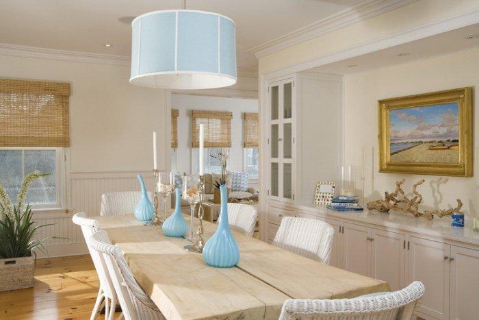
In this kitchen we found a design focused on coastal blue-and-white palette and cottage wicker. A design decision is to be added plenty of textures: wood table, floors and of course roman shades. But it looks very clean and spare. The right balance is achieved between beloved items and space for fresh breezes.
An open floor plan is always a perfect solution if your cottage looks like a warren of tiny rooms. Also this can be applied for the height, if you have low ceiling, consider to rip it out you can go up to the rafters.


