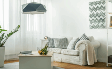
This “girly modern” style project that we will represent today is a deal of interior designer Melanie Coddington. This style is beloved from her and even she admits that it is often used by her. When we went through her home, we found one simple but decadent look with one unique, impeccable and full of quality items. Nothing is too expensive but it is felt very luxurious. Melanie makes a perfect combination between her style and of her clients too, and provides functionality for the people that are living in this home.
Melanie is the head of Coddington Design Company which is based in San Francisco. The company itself has been growing quickly and a year ago they opened a new office in LA when she started an e-design platform and made a blog. Coddington’s design is quite famous and is on demand for both women and men. In doesn’t matter that may be you will need years of experience to achieve such an exquisite design, we can broke down their techniques into five:
Accentuate on unique pieces:
The company’s logo is “Think custom, think vintage”. The home which we will look at is located in Coddington’s Potrero Hill in San Francisco. This home has a rich history, it was built in the beginning of the past century but it 1906 it was destroyed by an earthquake. Melanie has bought it in the end of 2007 and you can imagine how many work it takes to work on this luxurious furniture collection into its 1 400 square foot floor plan. In the dining room we see how professional Coddington paired the stylish mirror and the flea-market table with 18th century reupholstered dining chairs from Sweden.
The design of all mirrors, beddings and headboards have been done by Melanie. Actually she has undeniable advantage of her years of experience, brilliant sense of proportion and resources and she can afford herself the freedom to design her pieces in exactly way how she wants it.
Not everyone is quite gifted as her, but we don’t have to be worried as the little sense of unique and custom pieces still can be fulfilled if we use little personal touches to the furniture that already exist. We will give you some options – sewing fun fabric store find curtains, adding to the dresser new drawer pulls and painting with bright lacquer a vintage console.
On every surface apply luxurious textiles
The most important thing to not forget when you make a renovation is the investing in new stylish upholstery for furniture. The fabrics that Coddington often uses are leathers, silks, linens and silks, which add one extravagant feel even to the plain things. An example for that can be seen in her Potrero Hill home’s living room. Its couch was original vintage but for the renovation it was recovered in plush gold velvet and decadent. Vintage finds are also the swivel chair and wing chair but they were reupholstered too.
The wall space could not be ignored too. DeSousa Hughes is the brand of the exquisitely beaded wallpaper that is covering the wall in the living room.
The dining room for this Nob Hill home is designed for a male client and it is paired together with amazing club chairs that are upholstered in a Randolph & Hein fabric. We can feel the understated elegance from the lush silk velvet in the room. The side chairs are also designed by Melanie, who said that this part of the project was her favorite and it was a pleasure for her to design the side chairs to go with the rounded arm chairs. Melanie was very happy to find this mahogany table made by Maison Jansen and she knew that this little piece will be there forever. This unsophisticated room along with the beautiful views of Grace Cathedral becomes our favorite.
Choose a beautiful and plain color palette
Coddington’s client has a high profile position in some of the most popular clubs in San Fracisco so he wanted one sophisticated room with a possibility for entertainment. The Melanie’s task was to blend ivory, camel and black accents and the final result is a space allowing the simplicity of each piece to stand out. On the left we see custom swivel arm chairs, the fabrics of upholstery are from Nancy Corzine and Pindler & Pindler. In this room there are also vintage coffee table, Stark Carpet area rug and Global Views twig side table.
We will take a look on another living room designed by Coddington but this time in Hillsborough, California. This time the color palette is bolder and the design look more soothing and welcoming thanks to the understated greens, some pops of emerald and avoiding usage of too many different patterns.
Gather pieces with strong silhouettes. Let us back to the Potrero Hill home, where we have strong focus on structured frames and strong angles. Thanks to the similar design of the square sofa, bookshelf and the coffee table the room looks pulled together via a subtle polish. Interesting approach is that it was used similar shapes in most of the rooms to keep the classic forms all around the home. The furniture is bold and structured.
Coddington is a big fan of 1940s French Furniture and this reflects on her style in the showrooms finds. Evidence for that is the chair in the bedroom bought from Henredon in the Nob Hill’s apartment which looks very elegant and stylish. One unique and polished touch is achieved thanks to its clover-shaped back. What really makes a different is how this strong piece really stands out in this a bit smaller space. The mirror in the bedroom is from Pottery Barn, dressing table in white lacquer is by Barbara Barry from Henredon and the lamp is owned by the client.
Coddington is very passionate about structured headboards also. We cannot deny that the custom upholstered headboard in the bedroom is the element that just stands out in this room. There is one little touch of stylish feminine flair. Melanie admits that she designed this apartment to look elegant and luxurious but in the same way not pristine. Everyone that came in wants to just sit down immediately and to observe the beautiful designed elements. It is not necessary to buy the headboard together with the bed as it could be bought separately and also remember that if you find a better fabric you can reupholstered it for the future.
One different and successful design would be the mix of masculine and feminine details. A girly modern look could be achieved in one perfect way via combining masculine furniture pieces and stylish feminine accents. A visual effect is achieved thanks the contrast but in the same time the simple pieces make the style approachable and flexible. In the Coddington’s Potrero Hill home we found also this stylish sideboard that could be at home in a bachelor pad. The pleasant aesthetic opposition is achieved thanks to the sweet butterfly lamp, artwork, flower arrangement and other knickknacks.
What else we found in the Coddington’s own home is that aesthetic breakfast nook which was renovated into über-girly style with light blue loveseat, blue walls and luxurious chandelier. But what makes a difference here is the combination of materials. It has a little note of roughness thanks to the loveseat that is upholstered in wool. Very unexpectedly the curvy chair is upholstered in a sleekneoprene and the edgy artwork is from Artocracy.com.


