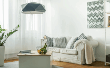
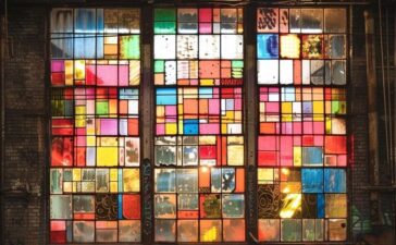
As we can see the site has a double frontage, to liberate the plan, there were designed additional light wells, series of voids and courtyards. The tiled courtyard is on contrast with the florist’s workshop, but this combination contribute living space to look cool and restful. There is a tiny light well with cascading planting; its function is to address the bright northern light. At the rear, an internal light well and glazed void separate the house in two. Thus, the light is swallowed deep into the home, which defines the open plan spaces of the ground floor.
The architect’s main goal is to create a home that is well suited for their client’s lifestyle. That’s why this home accommodates a broad range of details in an approximately small footprint. We can find in the house a plenty of rooms: home office and florist studio, which can be transformed into additional bedrooms or living spaces; and room to grow their kids or to house their steady flow of visitors.
Although the external spaces are constrained and compact, the house has a strong sense of connection to the garden. Our client works as florist and landscaping was very important to him. It needed to be with low maintenance but also provide texture and color to the home.
We had the pleasure to collaborate with Melissa Wilson Landscape Architects, which maximize the potential of the spaces in the garden. Luckily, we addressed a variety of catchy microclimates. How we did that? We created bespoken timber garden boxes, which hang in the shaded, greenly courtyard. This added the lush feel of space.
The approach this house was built is a “build-it-once and once only”. The design is created to manifest the inside energy of its parts and materials for a long period. The house is spatially efficient, because our main purpose was to reduce the frequency of our client’s commute. We have done this via incorporating a field of programs that allow them to work from home.
The home design provide myriad opportunities for sufficient natural light and cross-ventilation, because the home operates passively through most of the time during the year with the courtyard plan and glassy light well.
At its “Hartley St” address the Green House, compose a facade that is both modest and interesting to the streetscape. It makes a difference from the house we found at first place with raking roof-forms, matching alignments and setbacks. The single storey street frontage contradict the lavish two-storey home concealed behind the contemporary ridgeline.
The heavy urban context is at odds with the delightful feeling for the rear yard of the house, thanks to the studio form and boundary walls. The studio/garage typology is encountered and settled to address both the lane and the home. The architects insisted for a green band of vegetation consistent with neighboring properties.


