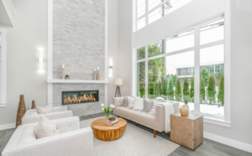
Our present project is case of Zack de Vito Architects for a sweet couple located in Russian Hill. In this luxury apartment the owners can enjoy a marvelous skyline views of the city’s downtown and the San Francisco Bay Bridge. We observe one delightful transformation of one traditional family home to one, which is propitiousfor entertain and display an exquisite art collection.
Thanks to the open floor plan of the apartment, the main areas are unshielded for the beautiful sky views and the sunlight. Meanwhile the inner rooms are separated by custom and rich cabinetry and sand painted walls. Another dimension is added to the space by the apartment’s lighting plan, giving it a museum-like finest quality. May be you need to see for yourself this sophisticated home space and decide if you could experiment with similar high-rise living.
All around the space are evenly disbursed the owner’s beautiful collection of graphic paintings that is in unison with the artifacts and custom cabinetry.
The dash of industrial flavor of the sophisticated kitchen is given by the bar stools, the stylish pendant lights and gray-hued countertops made from granite.
In the kitchen there are two rows of clearly designed upper cabinetry. The housewife use the cabinets closest to the ceiling to storage tiny kitchen appliances, while the darker-faced cabinets below house the dinnerware that are used every day and glasses. A little trick is providing of seemingly endless storage, which is made to look virtually disappeared thanks to the low-profile cabinet doors.
Let’s move to the bedroom that features sophisticated dark built-ins which are used for storing the family collectibles and clothing without to be interfered with the skyline amazing views.
The living room and the library are smartly divided by the multi-faced wall that features recessed wood cabinetry on the one side and oversized contemporary art.
Small tip for space planning:
When you have an open-concept plan, it is the best to use rugs that outline different spaces. On the photo we see how the rugs help to the living room, dining room and kitchen to be differentiated.
The bedroom is decided to be with clean, zen aesthetic design, which is fulfilled by the stylish chrome four-post complements of the bed. The feeling of comfort and texture is added by the light grey wool rug.
Small design tip: for special features in the spaces use recessed lighting, which can help you to highlight the attention to them. You can notice on your own how the light accent the artwork, sculptures and figurines that are placed around the library shelving.
The best description for this bathroom is pristine and bright and it includes raised wide soaking tub and a lavish marble shower. Small rustic edge is added by the warm wood elements.
And what do you think of the following project, that is very similar to the above one?


