Link Beauty Salon
The desire to build a fashion hot spot provoked the name of this beauty salon. Its first location didn’t met the need of more space for the expanding team of the salon and the owner had to move to a larger place.
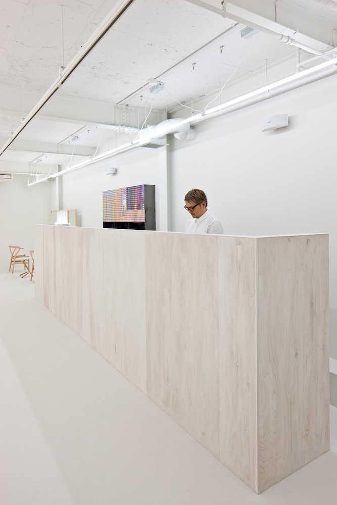
The architecture of the building where the new salon is accommodated has been developed some years ago. However, it was the perfect place to build the sustainable interior of the new fashion spot. The designers from Yasunari Tsukada Design followed the existing lines and curves of the existing architecture and arranged the interior in a manner that matches perfectly the style that has been previously designed. An interesting feature of the building is that it is long shaped. The shape is perfect to arrange the different functional spaces in a way that the designer lines flow from one area to another, subordinate to the main interior concept. A sense of abstraction has been achieved by painting the walls in white.
In order to satisfy the functional needs of the purpose of the salon, the mirrors, for example, were specially designed with surfaces that can be used as a storing objects containers. 3 dimensional lattice screens has been created, so that the walls could be flexible and extensible, without limiting their function. On the lattice there are several lighting fixtures, hooks, glass panels and others. They can also be used by the customers, not only the salon’s stuff.
In a hearted and inspiring conversation with the owner of the place, the designers found a lot of creative ideas that could be incorporated in the interior. The concept was changing during the time when new ideas appeared and provoked the designers to use their professional skills. They were actually enjoying the whole process because they simply love their job. And when your attitude to the profession is positive, you definitely incorporate this love into the things you made.


